When I was a young child occasionally someone I didn’t know – usually one of my mother’s co-workers – would give me an art book, generally of the Walter T. Foster “how to” variety. Walter T. Foster published those large thin paperbacks with titles such as How to Draw Horses and Of Course You Can Paint. I recall one particular occasion when my mother brought home a few of these books for me. One of them, Russell Iredell’s Drawing the Figure, had a nude on the cover, and my mother’s co-worker had warned, “You might not want to give this one to him until he’s older.” I don’t remember exactly what my mother said her response was, but it was obvious to me she thought that very idea was patently ridiculous.
While I did look at and appreciate these second-hand books, I don’t believe I ever did any of the exercises – I’ve never constructed form by first drawing a collection of cubes, cones, cylinders, and spheres; or started a figure drawing with a “line of action.”
The books I most treasured were those with lots of reproductions from art history. The anatomical distortion of Parmigiano’s The Madonna with the Long Neck, the vivid color in Degas’s Blue Dancers, the indescribable humanity of so many of Rembrandt’s figures – these were images that obsessed me as a child, images I knew from books. Even when I got a little older, however, I only had a handful of this type of volume. So what’s an idle young teen out to bend his mind a little to do? Go to the library, of course. As a kid I would from time to time make that trip, but I started frequenting my local branch of the Sacramento Public Library system specifically to look at art books during the summer after ninth grade, just prior to entering high school.
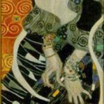
In the following few years, a whole world became available to me through those visits – the artists I learned about at the library during that time included Dante Gabriel Rossetti, Gustav Klimt, Oskar Kokoschka, Egon Schiele, Francis Bacon, Robert Rauschenberg, Jasper Johns, Roy Lichtenstein, and Andy Warhol. Some of them I already knew a little about; others, as far as I can remember, I discovered there – they are all still among the artists most important to me. The fact that at the time five of these painters were still alive and producing made their work feel as immediate as a new album by a favorite rock and roll band.1 As with the musical artists, I wanted to know about these painters whose work seemed so romantic to me. Although I still gravitated toward books comprised mainly of reproductions, I read biographies, as well. The first time I read both Popism: The Warhol ’60s and Interviews with Francis Bacon,2 two books which had a major impact on me, they were library copies.
It’s amazing to me now how recent much of this work was at the time; Pop Art made its splash less than two decades before, and Johns’ and Rauschenberg’s first shows took place only a few years prior to that. It also surprises me that books featuring these artists were on the shelves of my humble suburban branch of the library. I’m sure in the late ’70s and early ’80s, the general public considered these artists to be no-talent charlatans,3 but there those books were, waiting for me to discover them.
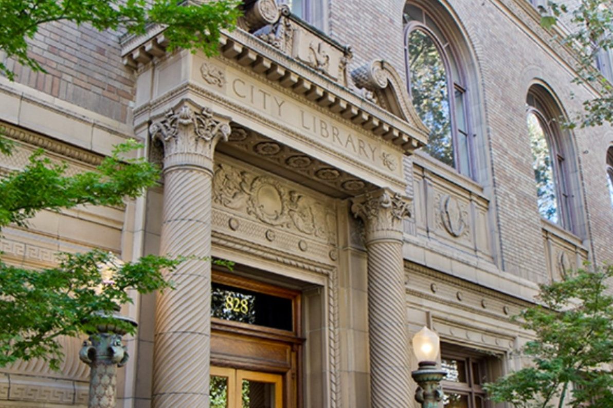
After I got a job and was able to purchase books for myself, I did so with some abandon and my personal collection really started to grow. Nevertheless, I continued to go to the library and discover artists new to me. When I moved to Midtown Sacramento in the mid-1980s, I lived just a few blocks from the McKinley Library, which I’d visit, but the Central branch became my favorite, as it had a considerably larger art section than the others. My life has been enriched immeasurably by books and the public library system, and this was especially true during those pivotal years as an impressionable teen and young adult.
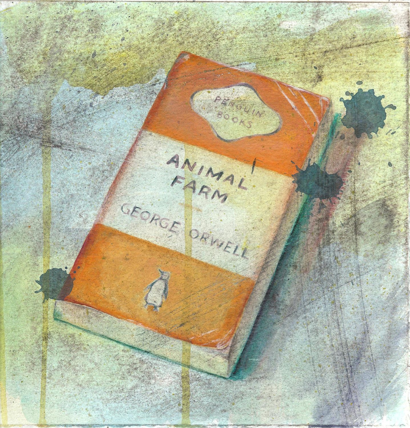
For the last several years, that very system has been under siege by little brownshirts who are attempting to erase from public discourse the personal stories of individuals and the histories of whole populations. According to a report by the American Library Association, the number of titles targeted for censorhip rose by 65% from 2022 to 2023. Francis Bacon, Robert Rauschenberg, Jasper Johns, and Andy Warhol all belong to one of the most heavily targeted groups, the LGBT+ community. Currently available through the Sacramento Public Library are books about or by all the above artists, plus others of whom the Thought Police would not approve, including Jenny Saville, Ross Bleckner, and Kara Walker. Let’s make sure those books and so many others stay on the shelves for us and for those kids seeking to expand and elevate their hearts, minds, and lives.
“Wherever they burn books they will also, in the end, burn human beings.” – Heinrich Heine, 1823
1 From The Beatles and The Stones, to Roxy Music and David Bowie, to Patti Smith and Television, rock and roll had a liberating power that held sway over me at the time. Sadly, although those old favorite bands still embody that spirit for me, rock and roll as a genre no longer does.
2 Andy Warhol and Pat Hackett (Harcourt Brace Jovanovich, 1980) and David Sylvester (Thames and Hudson, 1975), respectively.
3 Judging from many comments I’ve overheard even at recent museum shows, maybe they still are. For example, at From A to B and Back Again, the 2019 Andy Warhol retrospective at the San Francisco Museum of Modern Art, I witnessed a man browbeating his female companion because she stopped to look at some examples of the “Death and Disaster” series. “Car crashes?! Car crashes?! That’s not art!”
Recommended Reading: Susan Orlean: The Library Book (Simon & Schuster, 2018). Ostensibly about a 1986 arson fire at the Los Angeles Central Library, this book is part memoir, part true crime, part historical account, part love letter – all engaging, all wonderful.