I was on summer vacation from school, home alone with the TV on. A pre-teen, I didn’t know I was watching one of the most celebrated movies of all time, nor did I know the controversy it had caused.1 Nevertheless, I was riveted by the structure of the story – how it jumps around in time, how it is told from multiple points of view. I’ve seen Citizen Kane many times since that Saturday afternoon; it became one of my favorite movies, one I can watch over and over again. I can also put on the DVD while busy with something else and be guaranteed that for the next two hours, I can look up at any time and find what I see and hear to be engaging in any number of ways.

Citizen Kane is a cautionary tale of the potential dangers of power and the ultimate consequences of megalomania. The screenplay by Herman J. Mankiewicz and Orson Welles is superlative, full of great lines and scenes; Mr. Bernstein’s account of seeing the young woman on the ferry – “… A white dress she had on. She carried a white parasol. I only saw her for one second…” – is perhaps my favorite sixty seconds of movie dialogue, ever.

However, what I like most about the film is the look of it, its striking atmospheric quality. I don’t know much about film history, but from what I understand, American movies changed visually in the wake of Citizen Kane. Some of the highlights are showy – the camera going through the neon sign and into the skylight of the El Rancho nightclub; Susan Alexander Kane’s opera debut during which the camera is on her, then follows the shadow of the curtain going up and continues rising until it reaches two stagehands on a catwalk high above the stage. Although shots such as these are some of the most immediately arresting of the film, most of my favorite moments are much more subtle.

  • In the opening sequence, one sees the grounds of Xanadu, Kane’s San Simeon-like estate. From the front gate, through several shots as the camera gets closer and closer to the mansion, Kane’s lit bedroom window, no matter from what distance or from what angle it is viewed, always occupies the same location in the upper right of the screen.
  • In the News on the March newsreel segment, Charles Foster Kane, Emily Monroe Norton Kane, and Charles Jr. are shown in a newspaper photograph while the voice-over tells of the latter two’s deaths in an automobile accident. Much later in the film, after Kane’s speech at the political rally at Madison Square Garden, one sees this photo being taken.
  • In the picnic scene, Kane and Susan are arguing in the tent, and he slaps her. She looks up, her face hardened, and says, “Don’t tell me you’re sorry.” His reply is a deadpan “I’m not sorry,” and as the shot dissolves into the next scene, her left eye turns into an eye in the design of a stained-glass window at Xanadu.2

I’d probably watched the film at least half a dozen times before I noticed these details, but have relished them each time I’ve seen it since.

The screen-filling screeching cockatoo is a decidedly unsubtle moment, one which is both aurally and visually jarring. In This is Orson Welles,3 the book of interviews conducted by Peter Bogdanovich, Welles claimed it was simply a startling, dramatic effect placed late in the picture to wake up any dozing audience members. I’m certainly not a dedicated cinephile – I would barely describe myself as even a casual moviegoer, but I do have a theory about this particular shot. In Jed Leland’s flashback, he tells of the first time Kane and Susan met. That evening Charles entertained her by, among other activities, making a hand shadow puppet, which she guessed to be a giraffe or an elephant. In response, he chuckled, “It’s supposed to be a rooster” – it’s a lighthearted moment, one of the very few in the film where Kane seems happy. The cockatoo appears in the butler Raymond’s remembrance of the day Susan flew the coop, so the birds bookend the relationship, the ending of which left Kane a completely broken man.

I don’t know that Citizen Kane has directly influenced my painting, although, looking at the three stills above, one does wonder. The story itself is not inspiring at all – Charles Foster Kane quickly lost any artistic vision or creative impulse he may have possibly once possessed – but the manner in which it’s told certainly is. Like other notable works to which I was exposed at a young age, I think in Citizen Kane I recognized perhaps the most important concepts a prospective artist can contemplate – ambition and possibility.


1 Before the 1941 release of Citizen Kane, gossip columnist Hedda Hopper told William Randolph Hearst it was about him. Hearst contacted Louella Parsons, his own Hollywood gossip columnist, and ordered her to screen the film. After doing so, Parsons told Hearst that Kane was a thinly-veiled hatchet job on him. An infuriated Hearst banned any mention of the movie by his media empire, and publicly attacked director Orson Welles. In an attempt to avoid Hearst’s wrath from coming down on the entire industry, MGM chief Louis B. Mayer, on behalf of the top Hollywood movie moguls, offered RKO Radio Pictures more than the full production cost of the film so they could burn it. When that failed, the major studios refused to let Kane play in their theaters, so it couldn’t be widely seen – it lost money and was exiled to RKO’s vault until the mid-’50s. I’m sure that as I sat in front of the television that day, I was only aware of the name William Randolph Hearst because I had heard it on the news in 1974, when his granddaughter Patty was kidnapped by the Symbionese Liberation Army.

2 My old friend Chris B. studied film and was much more knowledgeable than I on the subject of Citizen Kane. He was the projectionist for a college film class, and each semester would provide me with a schedule so I could sit in on any of the screenings. I would always make time on the day Kane was shown – although VCRs were then becoming popular, I wouldn’t have one until well over a decade later, so I didn’t have many other opportunities to see it. He once asked me about my favorite parts in Kane and was surprised I had noticed the stained-glass eye; it was one of his favorite images in the movie, as well. Sadly, Chris passed away in 2001, shortly before his thirty-seventh birthday. We’d known each other for over twenty years. 

3 Jonathan Rosenbaum, editor; HarperCollins (1992). My copy is the revised Da Capo Press edition (1998). The collection is a fascinating look at Welles’ life, art, and insights into a multitude of other subjects. If nothing else, it proves that he was much more than the man behind the War of the Worlds radio broadcast and Citizen Kane, which he didn’t even consider his best film. I haven’t seen a lot of them, but think in addition to Kane, The Stranger and Touch of Evil are especially notable.

A few months ago, I had the opportunity to view five Andy Warhol screenprints from his Myths series, which includes images of The Shadow, Santa Claus, Mammy, Howdy Doody, Uncle Sam, The Witch, Superman, Dracula, The Star, and Mickey Mouse. The portfolio is notable in his oeuvre in that, with the exception of the few comic strip panels he painted when he first started using popular culture imagery, I believe they are the only fictional characters he ever depicted. My two favorites in the series are The Witch and The Shadow; the former is formally the most successful of the ten, the latter is reminiscent of his earlier work, and was recently among the pieces carefully removed from a drawer and placed before me, unframed and 

immediate. I had a sharp intake of breath upon seeing The Shadow; with its deep red and icy blue palette, with its dramatically-lit face and stagy silhouette which fills the majority of the picture plane, it is a striking image, for which Warhol himself served as model. Who knows what evil lurks in the hearts of men?

Eggs on Plate (1982).

In the autumn of 1981, in the local paper I saw a Weinstock’s department store insert announcing an upcoming appearance by Andy Warhol as part of their The Art of Giving holiday advertising campaign, of which the Myths portfolio was an integral part. At the time, Warhol occupied quite a bit of my brain space; I’d recently read Popism: The Warhol ’60s,1 and found the whole Factory scene terribly romantic in a seedy, amphetamined sort of way. It also seemed long ago and far away – it’s amazing to me now how recent it had actually been. Warhol had painted his seminal Campbell’s Soup Cans, the 32-panel polyptych which made up his first gallery show of Pop work, less than twenty years prior; and it had been only a little over thirteen years since he’d been shot twice and pronounced dead, which definitively ended that period – the “crazy, druggy,”2 open-Factory-door-policy period – of his career. Although I was very young when the ’60s came to an end, many of my cultural reference points were and continue to be from that time: the British Invasion, the Mercury/Gemini/Apollo missions, Haight-Ashbury, the Civil Rights movement, Silver Age comics, Swinging London, Pop Art. These were not common interests among people my age, who at the time were collectively frothing over REO Speedwagon’s Hi Infidelity, the Rubik’s Cube, and who shot JR.

In any case, I was a Warhol obsessive and his Weinstock’s appearance was an occasion I wasn’t going to miss. On Saturday November 14, a date sadly missing from The Andy Warhol Diaries,3 my older brother and I caught a bus going downtown and journeyed to the department store, where a line had already formed by the time we arrived. This was the first time I saw actual work by Warhol, as all ten prints were being exhibited in the store. Copies of the current issue of Interview magazine were distributed to attendees, and a woman circulated with a tray of chocolate-covered cherries, as if she were serving hors d’oeuvres at a cocktail party. When we got to the table where Warhol was seated, I was too much in awe to say much of anything while he was signing my Myths leaflet; nevertheless, seeing him was a real moment for me. My brother, for his part, handed Warhol a newspaper clipping and asked him if he would put his teeth marks in it. Warhol turned and whispered to Bob Colacello,4 who was standing by his side and leaned over to hear Warhol’s query. Colacello pointed to his own mouth and dutifully repeated the request, which the amused Warhol denied, then signed the paper and handed it back to my brother. We left the store and rode the bus back to the suburbs, far from the reality of the Factory, but close enough to bask in its mythology. That was the only encounter I ever had with Warhol; he would die just over five years later, following a gallbladder operation. He was fifty-eight years old.

It’s been four decades, almost to the day, since that particular trek to Weinstock’s, and in those intervening years, I’ve probably seen more actual work by Warhol than by any other artist. My favorite pieces tend to be from the 1960s, although he continued to do work I love through the ’70s and ’80s. The Myths portfolio doesn’t rank among his strongest – much of the depth and power in Warhol’s work was derived from his ability to create images which not only distilled the culture of the time, but did so in such a stark and authoritatively factual manner. The Myths look great, but because the subjects are fictional characters,5 they lack the compelling potency of the Car Crashes, the Jacqueline Kennedys, the Most Wanted Men, the skulls, the 1986 Self-Portraits. Despite this, they continue to hold a special place for me in Warhol’s body of work – you never forget your first time.


1 Andy Warhol and Pat Hackett; Harcourt Brace Jovanovich (1980).

2 Ibid, page 285.

3 Pat Hackett, Editor; Warner Books (1989).

4 Interview magazine Executive Editor and later the author of Holy Terror: Andy Warhol Close Up; HarperCollins (1990).

5 Warhol dodged this issue with The Shadow because he does not appear in costume – it can be read as simply a self-portrait.

While pretending to attend community college in the early/mid-1980s, I was enrolled in a drawing class in which the teacher described several of my sketches as “de Kooningesque.” At the time, I had very little knowledge of Willem de Kooning’s achievement, and wasn’t familiar with much beyond Woman I (1950-52) and Woman and Bicycle (1952-53), so I took her remark as a cue to investigate his work. I was immediately entranced by his early 1940s Women series – I loved the push/pull dynamic which results from the blurred distinction between the figure and ground. I loved the juxtaposition of the modeled and the flat portions of the fragmented bodies. I loved the geometric shapes which only minimally suggest interior environments. Although de Kooning subsequently painted many other more celebrated series, those early Women continue to be among my favorites in an oeuvre as rich as any ever produced. I soon became a fan of both his paintings and his drawings from all periods of his career, and over the years have been lucky enough to have seen quite a lot of his work, in both group and solo exhibitions.

The first time I visited what was then the new San Francisco Museum of Modern Art on Third Street was in 1995 to see the de Kooning show The Late Paintings, The 1980s. It was the first time a large selection of the titular work had been seen, and there was much talk about de Kooning’s late ’80s Alzheimer’s diagnosis; how much of a hand his assistants had had in producing the work; and whether the paintings were worthy of being considered part of his oeuvre. It has been over twenty-five years since I saw the show, but I do distinctly remember two specific impressions I had – one: that the paintings seemed to change over the course of the day, going from subtle and elegant to stark,1 and two: while a disease was ravaging his mind, de Kooning was still a better painter than anyone else. The 1980s work comprises an evolving yet coherent period which is the most lyrical of his career – although there are similarities between these paintings and those of other earlier periods, the simplified palette and open compositions make them very different from any of his prior work.

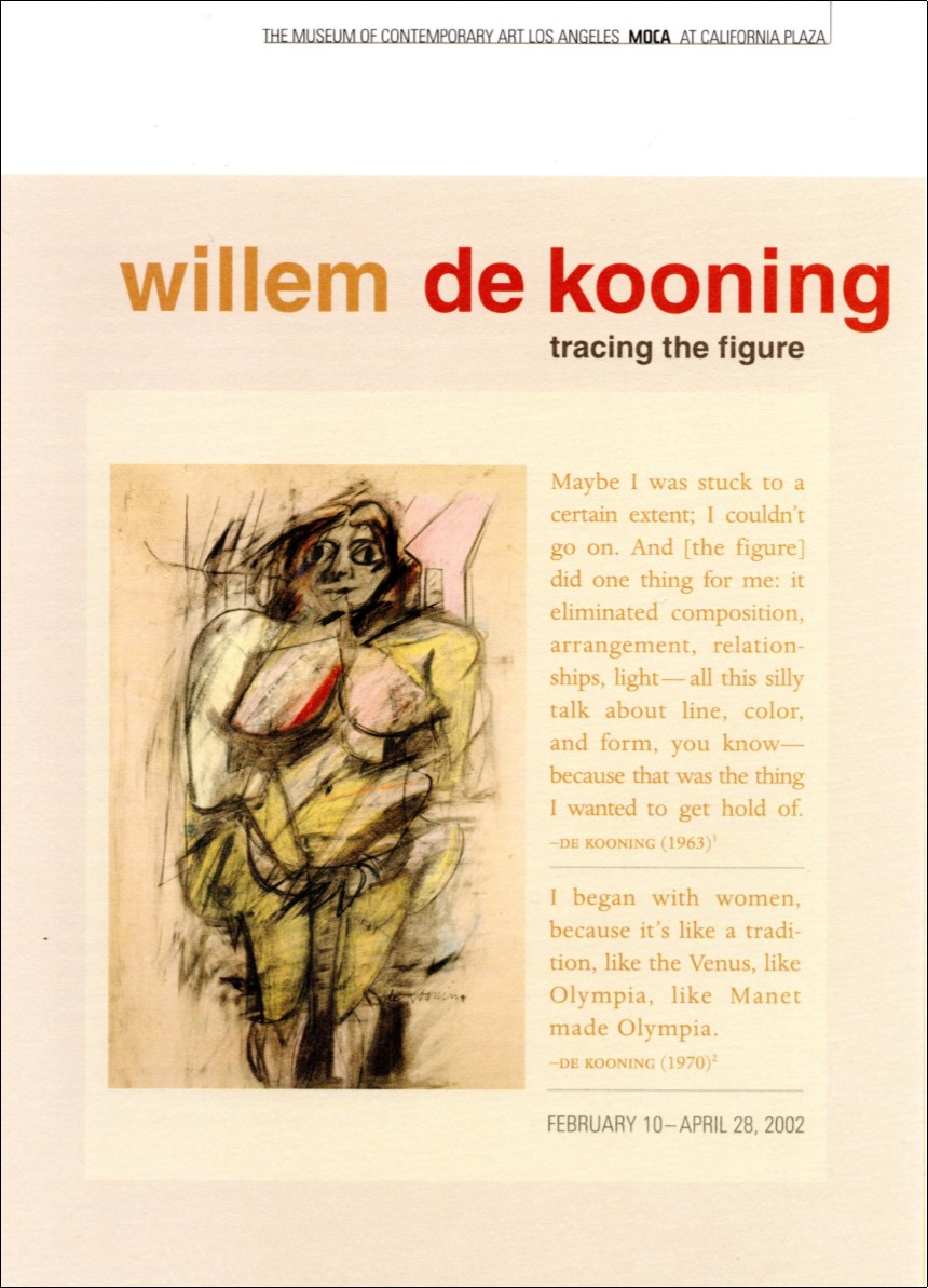
Willem de Kooning: Tracing the Figure show leaflet (2002); Los Angeles Museum of Contemporary Art.

In 2002, I saw the de Kooning drawing survey Tracing the Figure, which included work from the late 1930s to the mid-’50s, at the Los Angeles Museum of Contemporary Art and again at the SFMOMA. De Kooning’s processes of painting and drawing are often indistinguishable – he drew on his paintings and painted on his drawings. In addition to graphite, charcoal, pastel, crayon, and ink, he also used oil and enamel in his works on paper, and in the late ’40s started cutting up drawings to use as collage material. A good portion of the exhibition consisted of work related to his series of Women paintings from the early ’50s, by which time he also sometimes, in a striking Exquisite Corpse2-like manner, fashioned the figure from portions of two or more separate drawings. I was also particularly attracted to the results of the subtractive methods he employed – the smearing and the textured pentimento which remained after he erased sections of the image. Tracing the Figure was not only an extraordinary look at the drawings of a master, but also a comprehensive reference on the techniques of mark-making.

Willem de Kooning put down the tools of his labor for the last time in 1991, about two years after being diagnosed with Alzheimer’s. He passed away on March 19, 1997 at the age of ninety-two. If pressed to name my favorite painter, my answer might vary depending on whose work I happen to be fixated at that particular time. However, de Kooning would always be at least in the top two or three, a position he has held since shortly after I was prompted by a compliment to study his body of work. Thank you, Melinda Barbera.


1 Did the SFMOMA galleries have skylights prior to the re-model? I hope so, because the only other explanation I can think of for this phenomenon – which I’ve never noticed during any other exhibition – is that it was just my imagination running away with me.

2 Exquisite Corpse, or Cadavre Exquis, is a Surrealist game which generates collaborative compositions. The figure is divided into three or four horizontal sections. The first player draws the head and folds the paper to conceal what has been done. The next participant draws the torso and folds the paper again; the process is repeated until the figure is complete.

Sometime during the summer of 1990 my sister, who was then living in San Francisco, phoned to get my take on Jim Dine – I told her I loved his hearts and his robes and his use of real objects in his paintings. She listened patiently to my cursory knowledge of Dine’s oeuvre, then asked what I thought of his figure drawings, to which I responded I didn’t even know he did them.

“You should really get here right away and see this show,” she said.

My sister isn’t generally given to hyperbole, so the first chance I got, I made the trip to see Jim Dine: Drawings 1973-1987 at the de Young Museum. The show was comprised of figurative work, still lifes, and pieces which don’t fall into such neat categories – Dine’s hearts, robes, tools, et al. are images which, even when convincingly modeled, don’t inhabit space in the same manner as objects in more traditional compositions. Although I was attracted to all his imagery, at the time I was pretty much exclusively doing figurative work, so it was that to which I gravitated.

Dine started his career in the late 1950s and early ’60s with performances, installations, and paintings with actual bathroom fixtures and bedroom furniture; but in the early ’70s decided to focus his energy on perhaps the least avant-garde course of action an artist could have taken at that time: life drawing. His intensely-observed works of the human form eventually became aggressively-produced and expressionistic – characteristics which instigated the call from my sister. Dine draws, rubs out, builds up, erases, and reworks images with graphite, charcoal, pastel, acrylic, oil, enamel, and other media. This process results in multilayered works with rich, often distressed surfaces which reveal the histories of their creation. Despite the amount of reworking associated with these drawings, they are not labored or heavy-handed; on the contrary, they appear inevitable. Over the course of three years, two continents, and two different models, in The Sitter Progresses from London to Here in Three Years Dine managed to create a coherent, emotionally stirring and evocative figure which is enveloped by the atmospheric ground in a palpably physical way. The complexity, virtuosity, and diversity of the exhibited work was truly dazzling, and proved Dine to be one of the finest draftsmen in contemporary art.

My sister’s advice couldn’t have been better; seeing Drawings 1973-1987 was one of the most affecting and inspiring art experiences I’ve ever had. It wasn’t that I hadn’t seen heavily-worked mixed media drawings before – I was familiar with those by Willem de Kooning and Jasper Johns, both of whom had done pieces I loved which were so layered they could be considered paintings on paper. It was that I related to Dine’s drawings in a way that I was then unable to relate to those by de Kooning or Johns. Dine’s works aligned so perfectly with my aesthetic, I felt as if he had drawn them especially for me. I saw what could be achieved by disregarding the conventional definition of “drawing” and being open to the possibilites in utilizing any process or medium which would serve the work. Although I had never subscribed to the idea that paper is merely a support on which preparatory works for larger, more important pieces are made, and although I had already begun tentatively using paint in my own drawings, the way I thought about art was transformed. Occasionally, one has an experience and afterward never sees the world in quite the same manner – Drawings 1973-1987 was one of those events for me, one that has enriched my life immeasurably.

Jim Dine is still creating, following his muse. Right now, he is somewhere in the world, painting or sculpting or photographing or printmaking or drawing, making art. I love all forms of his work, but nevertheless, I’d kind of like to think he’s drawing.

“I never considered the Stones drug music. They were the drug itself.” – Patti Smith

All the art that has affected me in any meaningful way has been a psychedelic experience. I don’t mean that it was all drug-induced; I don’t even mean it’s all “hallucinatory.” What I mean is, it has all taken me to unexpected and unfamiliar places, expanded my consciousness, allowed me to view things in a broader or more concentrated fashion. Growing up in the suburbs of Sacramento, I was obsessed with finding new sounds and visions which would bend my mind. Citizen Kane; Bob Dylan’s 1965-66 three-album run of Bringing it All Back Home, Highway 61 Revisited, and Blonde on Blonde; Andy Warhol’s “Death and Disaster” paintings; Animal Farm; the “Penny Lane”/“Strawberry Fields Forever” single; Jasper Johns’ Target with Four Faces; David Bowie’s “Berlin Trilogy” – they have all been milestones in my life.

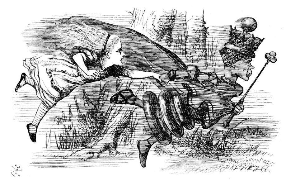
John Tenniel's drawing of Alice the Red Queen
John Tenniel: “Faster! Faster!” said the Red Queen, from Through the Looking Glass, and What Alice Found There (1872).

Lewis Carroll’s two Alice books certainly belong in this company. I’ve read each probably thirty-five or forty times, and keep coming back to them for any number of reasons, not the least of which is their quotability. It seems one can find an applicable Alice line for almost any situation, an indication of on how many levels the books can work. Alice has been viewed as a socio-political satire, a Freudian study, a hallucinogenic binge, a philosophical treatise. That Carroll himself certainly saw it as simply a children’s story is beside the point. I consider them to be tales of the heroine negotiating her way through anarchic, alarming, ridiculous, lonely, confusing, beautiful environments – in short, as metaphors for life. Contrariwise, they also serve as escapes from the same – they are two of the funniest books I’ve ever read. It was Carroll’s intent not that Alice educate, but that it entertain – this was unheard of in Victorian England, when children’s books were meant only to teach and/or moralize. Carroll succeeded brilliantly in much more than making the books entertaining; what he created 150 years ago was magical, something that even he would manage to equal only once more – when he wrote The Hunting of the Snark.

How Alice has affected my work is difficult to pin down. I’ve done a few pieces which explicitly reference the texts, but the real influence has been much more indirect. Oblique communication is a major theme in Alice; in my work, quotation, reference, and transformation – the subjects of which are generally well-cloaked – play important roles. Many years ago, these books irrevocably altered my thought process – they have contributed to not only the painter I am, but also the person.

In the spring of 1983, I was an eighteen-year-old suburban kid who had acquired a taste for twentieth century avant-garde art. As such, I was excited to learn that the forthcoming Talking Heads album, Speaking in Tongues, would have a Robert Rauschenberg-designed cover that would be available in an edition of 50,000 copies. I quite liked their previous record, Remain in Light, and was already looking forward to the new album, but this news made the release special for me. The record is on clear vinyl and the cover itself is clear plastic. Inside are three clear LP-size discs on which collages are printed in cyan, magenta, and yellow (the three colors which, along with black, are used in four-color printing). The whole package references Rauschenberg’s 1967 Revolver pieces, which feature motor-driven Plexiglas discs, the movements of which can be controlled by the viewer. He didn’t simply design an album jacket, he rethought what it could be.

The first time I saw actual work of Rauschenberg’s was a few years earlier – I was of high school age – during a family vacation. I don’t recall when exactly this was, or even what city we were in, but I do vividly remember wandering into an art gallery and being confronted by his Chow Bags suite of silkscreen/collage prints. I was already a casual fan of his work, which I’d seen only in books – as was the case with most contemporary art with which I was familiar at the time. Seeing the surfaces of these pieces, with the collage elements and plastic twine, was a significant experience and the impetus for me to learn more about his art. By the time Speaking in Tongues was released, I had read extensively about him and had a good knowledge of his career – my admiration was no longer in any way casual. Since then, I’ve seen a lot of his work in exhibitions both large and small, and my esteem for both the artist and the man has only grown.

At the San Francisco Museum of Modern Art during the winter of 2018, I twice saw Erasing the Rules, a comprehensive, career-spanning Rauschenberg retrospective. The exhibition contained work from the early 1950s to 2007, the year before he passed away. His silkscreen paintings, which were executed from 1962-64, were well-represented; they are among my favorite works from an oeuvre which I regard as as important and notable as anyone’s. In these pieces he expanded on ideas he explored in his earlier transfer drawings, but in a medium which could more vividly reproduce the photographs he was using. His juxtaposition of multiple, disparate images, which may have varying personal associations for individuals as well as wider cultural references, creates a poetic evocativeness which I find very engaging. In addition to the screened imagery, Rauschenberg also employed hand-painted gestural marks which hold the flat surface, opposing the three-dimensional illusion of the photographs. Although he is often credited with bringing imagery back into American painting, Rauschenberg was also intent on following the modernist tenet of keeping the picture plane flat. The resulting push/pull dynamic of this juxtaposition was conceptually very important to me while I was developing an aesthetic for my own work.

Rauschenberg continually expanded his artistic horizons, always utilizing new processes and collaborating with different people. This exploratory nature was an abiding aspect of his career, and Erasing the Rules showed his work to be perhaps the most varied and inventive of the twentieth century.

In 1990 I showed my drawings for the first time, at Dito Gallery in Sacramento CA. A few days after the reception, my mother told me about a conversation she had had with a gentleman there regarding one of the pieces, one which depicted an attractive young woman. She also asked if I was familiar with the film Laura; I was not. She told me it was about a police detective who falls in love with a painting of the titular murder victim, and that the way the man spoke about my drawing had reminded her of it.

It wasn’t until several years later, after I was given a used VCR, that I was finally able to see Laura. I’m not really a movie guy; I can be in possession of a DVD I want to watch, and it can sit around for months before I put it in the player. However, there are some movies I like very much and can watch over and over again. Laura, directed by Otto Preminger and based on the novel by Vera Caspary, is one of those.

The conventional but attractive portrait, which is an integral plot device, is actually not a painting at all – a photograph of Gene Tierney was retouched to appear as one. There was a painting done, by original director Rouben Mamoulian’s wife-to-be Azadia Newman, but when Preminger took over the directorial role, he decided it didn’t possess the mystery and allure required, and had Tierney sit for studio photographer Frank Polony. Although I haven’t seen Newman’s Laura painting, I have seen her portraits of Bette Davis and Carole Lombard, which are a bit stilted – it’s obvious why Preminger made the decision he did. In the film, the portrait is the work of Jacoby, one of Laura’s would-be suitors. According to Waldo Lydecker, Laura’s mentor/benefactor, Jacoby is a second-rate artist at best, one who “never captured her vibrance, her warmth.” The painting itself belies this assessment, and calls into question Lydecker’s reliability as a narrator.

Although considered a film noir classic, Laura doesn’t employ many of the genre’s usual trappings – there is a lot of cigarette smoking and some nighttime rain, but very little in the way of skewed camera angles or stark shadows. Most of the scenes take place in lavish, well-lit apartments, not seedy residential hotels; the detective isn’t crooked or cynical, he’s amiable and often plays with a children’s puzzle; Laura wasn’t a femme fatale, at least not in any traditional sense – she was, as Bessie, her domestic, describes her, “a real fine lady.” Her charm and kindness engendered an obsessive dedication in the people who knew her, and her portrait has a similar effect on Detective McPherson.

Some portraits do seem to hold this power: based on Ingres’s stunning 1845 painting of her, I have no doubt that Comtesse Louise Albertine d’Haussonville was a woman I would have wanted to know. It’s one of my favorite portraits – one of my favorite paintings – ever done. I’m not sure exactly what effect my drawing had on the gentleman with whom my mother spoke, but according to her, he was overcome by a certain ardor regarding the woman in the piece. While I don’t think of the drawing as a portrait, per se, it is of a specific person, a captivating young woman with whom I was quite smitten. It was a good likeness, but more importantly, it felt like her; it captured some of “her vibrance, her warmth.” I haven’t seen her in well over twenty-five years, but nobody was rubbed out with a shotgun loaded with buckshot, so I’m one up on Jacoby.

When I was maybe ten or twelve years old, an uncle gave me the book The Art Treasures of Europe by Charles Wentinck,1 which was my introduction to a lot of artists, some of whom would become favorites of mine. At the time, Rembrandt was my art hero2 – there are two of his pieces in Wentinck’s book: The Night Watch and Portrait of Jan Six, but as I was familiar with both, I turned my attention to the rest of the tome, which covers prehistory all the way up to the 1960s.

Although I liked many of the paintings illustrated,3 I had very visceral reactions, which I can still feel today, to five of them. These pieces played a large part in the development of my personal aesthetic.

Parmigianino: The Madonna with the Long Neck (1534-40).                                                                                                      I know next to nothing about Parmigianino, only what I read in this book and that he also painted the lovely Self-Portrait in a Convex Mirror, but this piece continues to captivate me. I was fascinated by the Mannerist proportions – I loved the Madonna’s neck and hands. I loved her gesture and the whole attitude of her posture. I loved the infant Jesus, who appears to be about six years old. I loved everything about this painting except the small figure in the background at the bottom right of the piece. He bothers me now as he did then. I’m not very knowledgeable about religious iconography, but I’m sure he’s a specific person, probably a saint, with a reason for being there – nonetheless, I find he distracts from the breathtaking delicacy and beauty of the Madonna, child, and attendant angels.

Dante Gabriel Rossetti: Ecce Ancilla Domini: The Annunciation (1850).                                                                                This is an early painting of Rossetti’s, and although I prefer his later work, it was a fine introduction. I had seen enough Renaissance “Annunciations” to know this was different; I’ve forgotten all the others, but this one has stayed with me. I found the color scheme striking – the painting is predominately white with splashes of the three primaries, which was very unusual for the time. The tight composition and vivid palette are indicative of Rossetti’s sensibility – much more modern, I think, than that of the Impressionists, who worked more-or-less contemporaneously.

Gustav Klimt: Salomé (1909).                                                                                                                                                          When I received the book, I had no idea who Salomé was, but I loved the tall thin undulating composition Klimt utilized, which I later learned was related to the “Dance of the Seven Veils” – studies for the painting indicate he arrived at the dynamic pose via sketching a dancing figure. Klimt’s use of ornamentation was also very attractive to me; the integration of the figurative and the decorative in this piece is particularly arresting. In the book, the Klimt segment appears in a chapter titled “Art as Experiment,” and by this time I was ready for the more modern work which would eventually inform my own. Klimt’s evocative imagery did so perhaps as much as anyone’s.

Otto Dix: Portrait of the Journalist Sylvia von Harden  (1926).                                                                                              This painting intrigued me to no end. Had it not been for the title, I wouldn’t have known if it were of a man or a woman. Her whole appearance – the mode of dress, the Bryan Ferry hair, the monocle, the positioning of her hands – drew me in. I don’t know that any other portrait, before or since, has made me so curious about its subject. Who was she? What was her life like? Although she sits in a bar or club, she is the only visible figure, alone in a corner with no window. There’s a feeling of liberation in the face of bleakness and desperation, which I would later learn was part of the bohemian culture of Weimar-era Germany, that I found very compelling. 

Francis Bacon: Two Figures (1953).                                                                                                                                                      What made Two Figures so captivating were its dualities. It looked like a photograph, and yet, with its bravura expressionist brushwork, was obviously not one; the bodies were convincingly fleshy, despite the grisaille palette; the private act seemed to take place in an artificial space, as if it were a performance. I loved the blurriness of the faces and how it was offset by the bold strokes demarcating the bed. I was also fascinated by the “space frame,” which I initially thought delineated the edges of the room; upon closer inspection, I found that to be only partially true, while at points it is superimposed on top of the image. 

I don’t know what it was about me that I was so powerfully drawn to these five particular paintings – I do remember I found them all slightly disturbing and strangely alluring, which in retrospect seems like a pretty good combination. I don’t think I analyzed the formal qualities of the work until a little later, but by the time I started painting, I had studied Rossetti, Klimt, and Bacon, and they had become profoundly important to me. All three continue to be among my favorite painters. Had I never been given Wentinck’s book, I’m sure I would have discovered all this work eventually, but seeing it when I did was pivotal in my growth in viewing art, and eventually making it. Thanks, Tom.

1 Simon & Schuster (1974).

2 An aunt had given me the Time-Life Library of Art book of his work. I don’t remember if I was already aware of him, but I loved that book, much more so than the Titian and Van Gogh volumes she also gave me.

3 A list of which includes Velasquez: The Royal Family (c. 1656), Ingres: The Turkish Bath (1863), Degas: The Blue Dancers (1890), Gerhard Richter: Ema, Nude on a Staircase (1966), and Richard Hamilton: Swingeing London 67 (1968).

Last issue, we heard about Corey’s love of work by Jack Kirby, Jim Mooney, and Ross Andru; and his eventual falling out with the superhero genre itself! Now: Corey once again ventures forth into the Marvel Universe, only to find…

From the late 1970s until the early 2000s, almost none of the comics I saw interested me. During those drought years, the only book I collected was John Byrne’s run on Sensational She-Hulk (1989, 1991-93). I find Byrne a competent artist, and his drawing had the right amount of goofy charm, but his writing was the real attraction of the book, the reason I became a fan of the character. In 2004, when I discovered a new She-Hulk book, it was my fond memories of Byrne’s version which enticed me to pick it up. The new book was clever and well-written, and the art compelling – definitely not the typical hypersexualized female superhero fare. Juan Bobillo’s elegant line is the antithesis of the boldness in Jack Kirby’s work. The meticulous craftsmanship he brings to his work is evident in his inventive layouts and striking character design. His idiosyncratic, cartoony style was a completely different approach to depicting a superhero, and it dovetailed perfectly with the savvy humor of the book.

In the early 2010s, I was given a collection called Spider-Man Loves Mary Jane, a retelling of Spider-Man’s early days from Mary Jane Watson’s point of view. I was unfamiliar with the book, which was then almost ten years old. Spider-Man’s heroics played only a peripheral role, the focus being the social lives of Mary Jane and her friends. Takeshi Miyazawa’s wonderful manga-influenced art captured the teenage experience in a way I’d never before seen. The facial expression and body language of that age are there with all the dramatic glory that they entail – the emotion in his work is visceral and affecting. More recently, Miyazawa worked on Ghost-Spider, a more traditional superhero book, albeit one with a young female lead – an alternate-universe Gwen Stacy being the one who gets bitten by a radioactive spider. In this context, Miyazawa shows his aptitude with action sequences, which he didn’t get much opportunity to do in SMLMJ. He does so with aplomb; he can effectively produce more than teen drama, although that is present – Gwen is college-aged, but still a teenager. Miyazawa also displays his versatility by changing the drawing style a bit from that in SMLMJ – though the work is still unmistakably his – it is more adult, appropriate for the tone of the book.

These days, when I stop by a comic store, I may pick something up because the character interests me, but even if the story is engaging, I usually find the artwork to be not very good to merely servicable. In a 2004 interview, writer/editor Len Wein (Amazing Spider-Man, Fantastic Four, Batman, Superman) expressed what he perceived as a problem with comics at that time – most younger writers and artists didn’t bring outside influences to the medium; they were just second, third, or fourth generation clones of older comics creators. However, Bobillo and Miyazawa prove that there are still creative people in the field who are doing interesting work. I hope to see more of that adventuresome spirit from other writers and artists in the future.

Excelsior!


All artwork © MARVEL.

When I was very young, even before I was able to read, my father would bring home comic books for my older brother and me. I was captivated not only by the stories, but also the drawings. My favorite artists were Jack Kirby (with whom I share a birthday) and Jim Mooney. Later, in the mid-1970s, when I would spend my own hard-earned quarters on Marvel titles at the neighborhood corner store, I really liked Ross Andru. I’ve been thinking about why my young self was so attracted to the work of these pencillers.

Kirby’s appeal is obvious – he was the de Kooning of the comic book world. Stan Lee even nicknamed him “King,” although I don’t think he had Willem in mind when he did so. Kirby’s work on Fantastic Four was so dynamic and so much more sophisticated than most comics of the time. He knew when to go big, which was often – the FF didn’t have much down time. This epic approach aligned perfectly with the near-operatic nature of the stories. His heroic portrayal of both men and women exuded power, and his depiction of otherworldly phenomena was mysterious and electrifying.

The main reason I liked Mooney’s Amazing Spider-Man work so much may have simply been the way he drew Gwen Stacy. I should note that during Mooney’s run, John Romita and John Buscema also worked on the book – sometimes all three would contribute to a single issue. Nevertheless, it was Mooney’s work which left the biggest impression on me. He surpassed even Romita in making both Gwen and Mary Jane Watson so glamorous and captivating, but approachable. MJ was an outgoing, sexy, flamboyant party girl, but my heart belonged to Gwen, a subdued, attractive, thoughtful young woman – a sort of Grace Kelly-type. Mooney not only made her look beautiful, but strong, as well. She was sensitive, but no pushover. This was important to me as someone who, even as a child, found Olive Oyl offensive. (By the way, don’t get me started on Mr. Magoo, either.) On the other end of the spectrum, Mooney also drew a great J. Jonah Jameson, who is no beauty by any conceivable measure.

When one hears talk of great Spider-Man pencillers, Andru is usually left out of the conversation, but I think he ranks among the best. He portrayed one aspect of the stories – New York City – better than any previous Spider-Man artist. He gave the books the feel of being in a specific setting – they didn’t take place in a generic big city. Besides depicting landmarks, Andru also drew the canyonesque city from every imaginable angle, from street level to dizzying heights – NYC itself became a character in the book. In addition to excelling at capturing the face of the city, Andru was also notable for his faculty with human facial expression; one could even see emotion on Spider-Man’s mask. Another of his strengths was conveying movement, so important in a superhero comic. He sometimes did so by having multiple versions of the same figure in a single panel. At the time, I didn’t know the term Futurism, and may have been only vaguely familiar with Duchamp’s Nude Descending a Staircase, but nonetheless I knew it was compelling.

Each of these artists also had an impeccable sense of visual clarity, as well as a strong compositional eye. I don’t think I thought much about any of this until I was a young teenager – I just knew what I liked. However, I do believe that seeing this work at such a young age did instill in me the importance of those aspects of drawing.

By the 1980s, although I would occasionally wander into a comic shop, which was then a new thing, what I saw didn’t interest me. The time when superhero comics spoke to me had seemingly passed.

Next Issue: The Thrilling Conclusion!


All artwork © MARVEL.