When I was maybe ten or twelve years old, an uncle gave me the book The Art Treasures of Europe by Charles Wentinck,1 which was my introduction to a lot of artists, some of whom would become favorites of mine. At the time, Rembrandt was my art hero2 – there are two of his pieces in Wentinck’s book: The Night Watch and Portrait of Jan Six, but as I was familiar with both, I turned my attention to the rest of the tome, which covers prehistory all the way up to the 1960s.

Although I liked many of the paintings illustrated,3 I had very visceral reactions, which I can still feel today, to five of them. These pieces played a large part in the development of my personal aesthetic.

Parmigianino: The Madonna with the Long Neck (1534-40).                                                                                                      I know next to nothing about Parmigianino, only what I read in this book and that he also painted the lovely Self-Portrait in a Convex Mirror, but this piece continues to captivate me. I was fascinated by the Mannerist proportions – I loved the Madonna’s neck and hands. I loved her gesture and the whole attitude of her posture. I loved the infant Jesus, who appears to be about six years old. I loved everything about this painting except the small figure in the background at the bottom right of the piece. He bothers me now as he did then. I’m not very knowledgeable about religious iconography, but I’m sure he’s a specific person, probably a saint, with a reason for being there – nonetheless, I find he distracts from the breathtaking delicacy and beauty of the Madonna, child, and attendant angels.

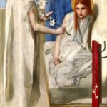
Dante Gabriel Rossetti: Ecce Ancilla Domini: The Annunciation (1850).                                                                                This is an early painting of Rossetti’s, and although I prefer his later work, it was a fine introduction. I had seen enough Renaissance “Annunciations” to know this was different; I’ve forgotten all the others, but this one has stayed with me. I found the color scheme striking – the painting is predominately white with splashes of the three primaries, which was very unusual for the time. The tight composition and vivid palette are indicative of Rossetti’s sensibility – much more modern, I think, than that of the Impressionists, who worked more-or-less contemporaneously.

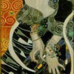
Gustav Klimt: Salomé (1909).                                                                                                                                                          When I received the book, I had no idea who Salomé was, but I loved the tall thin undulating composition Klimt utilized, which I later learned was related to the “Dance of the Seven Veils” – studies for the painting indicate he arrived at the dynamic pose via sketching a dancing figure. Klimt’s use of ornamentation was also very attractive to me; the integration of the figurative and the decorative in this piece is particularly arresting. In the book, the Klimt segment appears in a chapter titled “Art as Experiment,” and by this time I was ready for the more modern work which would eventually inform my own. Klimt’s evocative imagery did so perhaps as much as anyone’s.

Otto Dix: Portrait of the Journalist Sylvia von Harden  (1926).                                                                                              This painting intrigued me to no end. Had it not been for the title, I wouldn’t have known if it were of a man or a woman. Her whole appearance – the mode of dress, the Bryan Ferry hair, the monocle, the positioning of her hands – drew me in. I don’t know that any other portrait, before or since, has made me so curious about its subject. Who was she? What was her life like? Although she sits in a bar or club, she is the only visible figure, alone in a corner with no window. There’s a feeling of liberation in the face of bleakness and desperation, which I would later learn was part of the bohemian culture of Weimar-era Germany, that I found very compelling. 

Francis Bacon: Two Figures (1953).                                                                                                                                                      What made Two Figures so captivating were its dualities. It looked like a photograph, and yet, with its bravura expressionist brushwork, was obviously not one; the bodies were convincingly fleshy, despite the grisaille palette; the private act seemed to take place in an artificial space, as if it were a performance. I loved the blurriness of the faces and how it was offset by the bold strokes demarcating the bed. I was also fascinated by the “space frame,” which I initially thought delineated the edges of the room; upon closer inspection, I found that to be only partially true, while at points it is superimposed on top of the image. 

I don’t know what it was about me that I was so powerfully drawn to these five particular paintings – I do remember I found them all slightly disturbing and strangely alluring, which in retrospect seems like a pretty good combination. I don’t think I analyzed the formal qualities of the work until a little later, but by the time I started painting, I had studied Rossetti, Klimt, and Bacon, and they had become profoundly important to me. All three continue to be among my favorite painters. Had I never been given Wentinck’s book, I’m sure I would have discovered all this work eventually, but seeing it when I did was pivotal in my growth in viewing art, and eventually making it. Thanks, Tom.

1 Simon & Schuster (1974).

2 An aunt had given me the Time-Life Library of Art book of his work. I don’t remember if I was already aware of him, but I loved that book, much more so than the Titian and Van Gogh volumes she also gave me.

3 A list of which includes Velasquez: The Royal Family (c. 1656), Ingres: The Turkish Bath (1863), Degas: The Blue Dancers (1890), Gerhard Richter: Ema, Nude on a Staircase (1966), and Richard Hamilton: Swingeing London 67 (1968).

Last issue, we heard about Corey’s love of work by Jack Kirby, Jim Mooney, and Ross Andru; and his eventual falling out with the superhero genre itself! Now: Corey once again ventures forth into the Marvel Universe, only to find…

From the late 1970s until the early 2000s, almost none of the comics I saw interested me. During those drought years, the only book I collected was John Byrne’s run on Sensational She-Hulk (1989, 1991-93). I find Byrne a competent artist, and his drawing had the right amount of goofy charm, but his writing was the real attraction of the book, the reason I became a fan of the character. In 2004, when I discovered a new She-Hulk book, it was my fond memories of Byrne’s version which enticed me to pick it up. The new book was clever and well-written, and the art compelling – definitely not the typical hypersexualized female superhero fare. Juan Bobillo’s elegant line is the antithesis of the boldness in Jack Kirby’s work. The meticulous craftsmanship he brings to his work is evident in his inventive layouts and striking character design. His idiosyncratic, cartoony style was a completely different approach to depicting a superhero, and it dovetailed perfectly with the savvy humor of the book.

In the early 2010s, I was given a collection called Spider-Man Loves Mary Jane, a retelling of Spider-Man’s early days from Mary Jane Watson’s point of view. I was unfamiliar with the book, which was then almost ten years old. Spider-Man’s heroics played only a peripheral role, the focus being the social lives of Mary Jane and her friends. Takeshi Miyazawa’s wonderful manga-influenced art captured the teenage experience in a way I’d never before seen. The facial expression and body language of that age are there with all the dramatic glory that they entail – the emotion in his work is visceral and affecting. More recently, Miyazawa worked on Ghost-Spider, a more traditional superhero book, albeit one with a young female lead – an alternate-universe Gwen Stacy being the one who gets bitten by a radioactive spider. In this context, Miyazawa shows his aptitude with action sequences, which he didn’t get much opportunity to do in SMLMJ. He does so with aplomb; he can effectively produce more than teen drama, although that is present – Gwen is college-aged, but still a teenager. Miyazawa also displays his versatility by changing the drawing style a bit from that in SMLMJ – though the work is still unmistakably his – it is more adult, appropriate for the tone of the book.

These days, when I stop by a comic store, I may pick something up because the character interests me, but even if the story is engaging, I usually find the artwork to be not very good to merely serviceable. In a 2004 interview, writer/editor Len Wein (Amazing Spider-Man, Fantastic Four, Batman, Superman) expressed what he perceived as a problem with comics at that time – most younger writers and artists didn’t bring outside influences to the medium; they were just second, third, or fourth generation clones of older comics creators. However, Bobillo and Miyazawa prove that there are still creative people in the field who are doing interesting work. I hope to see more of that adventuresome spirit from other writers and artists in the future.

Excelsior!


All artwork © MARVEL.

When I was very young, even before I was able to read, my father would bring home comic books for my older brother and me. I was captivated not only by the stories, but also the drawings. My favorite artists were Jack Kirby (with whom I share a birthday) and Jim Mooney. Later, in the mid-1970s, when I would spend my own hard-earned quarters on Marvel titles at the neighborhood corner store, I really liked Ross Andru. I’ve been thinking about why my young self was so attracted to the work of these pencillers.

Kirby’s appeal is obvious – he was the de Kooning of the comic book world. Stan Lee even nicknamed him “King,” although I don’t think he had Willem in mind when he did so. Kirby’s work on Fantastic Four was so dynamic and so much more sophisticated than most comics of the time. He knew when to go big, which was often – the FF didn’t have much down time. This epic approach aligned perfectly with the near-operatic nature of the stories. His heroic portrayal of both men and women exuded power, and his depiction of otherworldly phenomena was mysterious and electrifying.

The main reason I liked Mooney’s Amazing Spider-Man work so much may have simply been the way he drew Gwen Stacy. I should note that during Mooney’s run, John Romita and John Buscema also worked on the book – sometimes all three would contribute to a single issue. Nevertheless, it was Mooney’s work which left the biggest impression on me. He surpassed even Romita in making both Gwen and Mary Jane Watson so glamorous and captivating, but approachable. MJ was an outgoing, sexy, flamboyant party girl, but my heart belonged to Gwen, a subdued, attractive, thoughtful young woman – a sort of Grace Kelly-type. Mooney not only made her look beautiful, but strong, as well. She was sensitive, but no pushover. This was important to me as someone who, even as a child, found Olive Oyl offensive. (By the way, don’t get me started on Mr. Magoo, either.) On the other end of the spectrum, Mooney also drew a great J. Jonah Jameson, who is no beauty by any conceivable measure.

When one hears talk of great Spider-Man pencillers, Andru is usually left out of the conversation, but I think he ranks among the best. He portrayed one aspect of the stories – New York City – better than any previous Spider-Man artist. He gave the books the feel of being in a specific setting – they didn’t take place in a generic big city. Besides depicting landmarks, Andru also drew the canyonesque city from every imaginable angle, from street level to dizzying heights – NYC itself became a character in the book. In addition to excelling at capturing the face of the city, Andru was also notable for his faculty with human facial expression; one could even see emotion on Spider-Man’s mask. Another of his strengths was conveying movement, so important in a superhero comic. He sometimes did so by having multiple versions of the same figure in a single panel. At the time, I didn’t know the term Futurism, and may have been only vaguely familiar with Duchamp’s Nude Descending a Staircase, but nonetheless I knew it was compelling.

Each of these artists also had an impeccable sense of visual clarity, as well as a strong compositional eye. I don’t think I thought much about any of this until I was a young teenager – I just knew what I liked. However, I do believe that seeing this work at such a young age did instill in me the importance of those aspects of drawing.

By the 1980s, although I would occasionally wander into a comic shop, which was then a new thing, what I saw didn’t interest me. The time when superhero comics spoke to me had seemingly passed.

Next Issue: The Thrilling Conclusion!


All artwork © MARVEL.

As the 1970s were coming to a close, David Bowie hosted a radio show on which he played eleven pieces of the decade’s music which he considered important. Among them was “Trial/Prison,” from an opera called Einstein on the Beach. The artist/composer was Philip Glass – I had never heard of him, but was immediately transfixed. Although conceptually, the music wasn’t so alien to me – I’d read Paul McCartney’s thoughts on Karlheinz Stockhausen, and Pete Townshend’s on Terry Riley – it really was unlike anything I’d heard before. This was not a rock song, it was something quite outside the realm of my experience, and I wanted more.

I went to Sidewinder, the local used record shop I’d been frequenting since before I was a teenager, and purchased my first Philip Glass record, North Star. I was hooked. It was a few years later when I finally found a copy of Einstein, the whole of which was a revelation to me. The music was mesmerizing, hypnotic, and not “operatic” in any sense that I understood. The idea one could make a “portrait opera” with no plot or character development to speak of, yet that was evocative and compelling, informed my thinking of a figurative art with no use of narrative which was nonetheless emotionally engaging. Of course, this concept was far from new, but as a young painter, one must often come to ideas via one’s own avenues of thought. Glass’ music helped open those avenues for me.

At the close of Einstein’s first run of performances in 1976 – 35 sold-out shows, two in NYC, the rest across Europe – Glass and dramatist Robert Wilson were $100,000 in the red. Staging an opera is not a money-making proposition; what Einstein did make for them both were careers. Two years later – not long before I heard “Trial/Prison” for the first time – Glass was able to quit his cab driver gig and write and perform music full time.

Philip Glass/Robert Wilson: Einstein on the Beach tickets. Zellerbach Hall; Berkeley CA (2012).

The first time I saw Philip Glass live was in 1986 at Davies Symphony Hall in San Francisco; he and his ensemble played the Songs from Liquid Days song cycle in its entirety and A Descent into the Maelström. Over the years, I’ve seen him many times, including performances of Satyagraha, La Belle et la Bête, and Koyaanisqatsi. Perhaps most notably, in 2012, I saw Einstein on the Beach in its West Coast premiere run, which was one of the most affecting musical experiences of my life. At almost five hours long, Einstein immerses the audience in its aesthetic – not only the music, but Wilson’s imagery and the choreography of Lucinda Childs, plus the contributions of the rest of the creative team. Einstein is not the vision of one person, but Glass’ music is the unifying component which gives it the power which has not diminished with time. Experiencing it was as startling as hearing “Trial/Prison” for the first time, thirty-three years before. I had never seen anything like it, and I don’t imagine I ever will again – I feel fortunate to have been there.

Philip Glass is no longer seen as an avant-garde madman as he was in the 1970s; having composed the music for many mainstream films, he is now firmly in the popular culture. Although he still gets more than his share of abusive press, he is widely regarded as one of the most important and influential composers of the last half century. He turns eighty-four years old today.

In 1982, a young woman I was dating gave me a copy of Alice’s Adventures in Wonderland, which was, and continues to be, one of my favorite books. It was a newly-published edition, illustrated and designed by Barry Moser, with whom I was not familiar. I’d seen many versions of Alice, but John Tenniel was not only the tale’s first illustrator, but also, as far as I was concerned, the preeminent one. A lot of illustrators apparently feel similarly, as so many other versions are strangely adherent to his vision, not only in terms of look and feel, but even in composition. Moser’s work, however, was different – it was strange and it was off-kilter and it complemented the anarchic text in a manner completely unlike that of any other illustrations I’d seen. His is also the only version, as far as I know, in which all the images are from Alice’s point of view – it is her dream, after all. Moser’s eye for the bizarre yet humorous made him an ideal illustrator for Alice. I became a fan at first glance, and the next year, when his Through the Looking-Glass, and What Alice Found There was published, I immediately bought it for myself (the gal was out of the picture by that time). These two volumes also sparked my interest in the art of book design, which was something I’d never really given thought to, prior.

Several years later, there was an exhibition of Moser’s work at the Museum of Ancient and Modern Art, which was then in Nevada City CA. Sadly, I was unable to attend the reception, although I was fortunate enough to see the show, which was comprised of wood engravings from both Alice books. I haven’t done a lot of printmaking, but I do know a little about it and find it fascinating. Wood engraving is a relief process done on the end grain of the wood, so much finer detail is possible, as compared to a woodcut. Moser’s prints were technically exquisite and beautifully pulled, and his richly detailed and inventive imagery was aesthetically awe-inspiring. It turned out this was not only true of of his work on Alice.

Barry Moser show catalogue (1987). MAMA.

The museum shop had some of Moser’s books for sale, and I purchased his Frankenstein; or, The Modern Prometheus, and was told a story which he had related at the reception regarding his images of the monster. Apparently, he constructed his model by covering a human skull with raw chicken, sewing it together, then leaving it outside to rot. That his depiction bears no resemblance whatsoever to the ubiquitous Boris Karloff image again attests to the singularity of his vision.

Since then, I have assembled a small collection of Moser-illustrated books; his work – drawings and watercolors as well as the engravings – is consistently captivating. This is especially noteworthy considering the broad spectrum of books on which he has worked: The Divine Comedy, The Three Little Pigs, Moby Dick, Just So Stories, The Scarlet Letter, The Holy Bible, the list goes on. To date, he has illustrated and/or designed over three hundred books – I would feel comfortable recommending any of them; such is my regard for him and my confidence in his work.

Thank you, Marie, wherever you may be, for the introduction.

Don’t get me wrong; he was great. Really, really great. One of the best. But she didn’t need him. Yoko Ono was a respected, successful artist long before she met John Lennon. Of course, when they got together, their whole lives became an artistic collaboration, a two-person performance piece on the global stage. It was a challenge to which, against almost unbelievable adversity, she admirably rose. Like almost everyone, I only became aware of her through her marriage. Unlike a lot of people, I never thought that she was a Dragon Lady, a Svengali, a charlatan, an evil witch – that was racist, sexist, vitriolic character assassination; or that she broke up the Beatles – they didn’t need any help with that. I was a young teenager when I started learning about her work, and it was unlike anything I’d encountered prior. She was my introduction to conceptual art before I even knew the term. Her all-white chess set turned not only what I knew about art, but also the way I thought about it, upside-down.

In July 2002, I saw Yes, a traveling retrospective of Ono’s work which came to the San Francisco Museum of Modern Art. Artistically, she casts as wide a net as anyone in the twentieth century or beyond; her oeuvre includes written instructions, paintings, objects, installations, performances/events, advertising media, films, music – all of which were represented in the exhibition. About twenty-five years after first reading about and seeing photos of them, I finally got to experience White Chess Set and Eternal Time, another piece which jolted my perception when I was thirteen or fourteen. It consists of a clock with neither an hour nor a minute hand, but a stethoscope with which to listen to the continuous beat of a second hand. The kinds of questions these koan-like objects raise – How is chess played when one can’t distinguish between one’s own men and those of the opponent? and What does a clock measure if it doesn’t tell the time? – are at the heart of much of Ono’s work. She invites a questioning of the status quo, a collective meditation on the concepts of possibility, of visualization, of transformation.

Born in Japan and raised both there and in the United States, Ono drew inspiration from Eastern tradition and brought it to the Buddhism-enamoured Western avant-garde. Her poetic sensibility gives her pieces a beauty not generally associated with conceptual art, which she more or less invented with her Instruction Paintings, a series of “imaginary pieces” to be constructed in the reader’s mind:

PAINTING FOR THE WIND

Cut a hole in a bag filled with seeds of any kind
and place the bag where there is wind.

1961 Summer

Ono’s work has always embodied an activist spirit, a (N)utopian optimism which I find admirable and inspirational, if not personally attainable; it has no trace of the irony or cynicism present in much contemporary art. The hopeful nature which has imbued her work since the early 1960s, although not unusual in the counterculture of that decade, is now anomalous to the point of being revolutionary. Like Robert Rauschenberg and Patti Smith, two other of my artistic icons, Ono has the belief that art can be a moral force for good and has the capability to instigate real and positive change in both individual and wide-ranging ways. Don’t you know that you can count me in.

“A dream you dream alone is only a dream – a dream you dream together is reality.” – Yoko Ono

“Yoko’s work is very dangerous. If one is not careful it could get one thinking and may cause one to form an opinion. A subversive notion if there ever was one.” – David Bowie

Since 2016 the handbasket that is the United States has been on a non-stop flight to its proverbial destination.1 The landing gear is down and our seats are in the full upright and locked position – I advise strapping in and bracing for impact.

There have been some terrible years for the US during my lifetime: in 1968, Martin Luther King Jr., Robert Kennedy, and Andy Warhol were shot, and nearly 17,000 troops were killed in Vietnam; in both 1994 and 1995, over 49,000 people died from AIDS-related complications; in 2001, there were the September 11 terrorist attacks, in which nearly 3000 people died, and their aftermath. Eventually we’ll see how history will view 2020, although I’m confident I know without the benefit of hindsight what the results of that exercise will be. Up to this point, we’ve seen over 226,000 deaths from COVID-19 (“their new hoax”); over 8.5 million acres burned in wildfires (“… you got to get rid of the leaves”); social unrest of a magnitude unheard of in decades (“[Black Lives Matter] is a symbol of hate”); and complete and utter ineptitude, amorality, narcissism, nepotism, bigotry, and corruption in the highest levels of government (“No, I don’t take responsibility at all”).2

On a personal level, one of my closest friends passed away in July. For me, 2020 has been the worst year ever –  that includes 2001, when a friend’s body was found and the police called me because my phone number was in his wallet. I was asked to call his family to tell them to contact the “hospital.” It includes 2004, when I was laid up for months following a car accident and I had to learn how to walk again. It’s been worse than 2013, when a friend was killed by a tow truck that ran a red light and hit his car, and a month later my grandmother passed away. As horrible as all those things were, they were at least knowable; they allowed for an emotional process. 2020 has been worse because of the uncertainty of it all, the knowledge that our health is reliant on other people doing the right thing, and the profound dread of what could happen next Tuesday.

News From Home show announcement (2020). Archival Gallery.

One often hears from artistic people that “[my vocation] saved my life.” I’ve never really thought that, but during these recent months, I have felt that painting has kept me on the good side of the mental health line. It’s kept me busy, given me something on which to focus, allowed me some sense of accomplishment while isolated. Even so, I haven’t had an easy time of it,3 and the resulting show is not the one I had envisioned a year ago. I had been exploring ideas while working on three-dimensional mixed media constructions, ideas which I had planned on integrating into paintings for this show. Unfortunately, due to my scattered state of mind, I was unable to deliver on that – only one piece in the show is made with anything beyond paint on canvas. None of the pieces are connected conceptually; they too are scattered, so perhaps this is a perfectly appropriate show for me to mount as we near the end of this shattered year.

News from Home will run from November 5 to December 5, 2020 at Archival Gallery in Sacramento CA.


1 Mixed Metaphors “R” Us.

2 Four actual quotes from he who is currently squatting in the White House. Squatting in more ways than one.

3 I am very aware that a lot of people have had it much worse than I.

What is the relationship between activism and art? I believe it is the responsibility of everyone to be socially engaged; for an artist, that may or may not include creating work which addresses the issues of the day. Either way, one can be pushed to the point where action is required – where one is compelled to say something using any available forum. Art is another platform in which to make one’s voice heard.

Barbara Kruger is an artist with something to say and the ability to make captivating art to say it. Her work is as quotable as it is visually arresting; the phrases “Your body is a battleground” and “I shop therefore I am” are familiar to people who wouldn’t recognize her name and have never set foot in an art gallery. In 1999, I twice saw a retrospective, titled simply Barbara Kruger, of her work at the Los Angeles Museum of Contemporary Art; it was one of the most aggressive and audacious shows I’ve ever seen.

Kruger arranges a relationship between her work and the viewer with phrases regarding different power structures: sexual/gender-based, political, economic. The words come from different “narrators” and are by turns accusatory (“You substantiate our horror”), questioning (“Who dies first?”), exclamatory (“Hate like us”), aphoristic (“Doubt tempers belief with sanity”). These terse, confrontational phrases, along with her visual acuity, combine to make some of the most provocative art of the last forty years.

Barbara Kruger show leaflet (1999). LAMOCA.

In addition to the silkscreens, the show also featured photographs, engravings, lenticular works, sculpture, video, and, perhaps most notably, an installation. One wall was covered, floor to ceiling, with two black and white photos of a screaming face, mirror images of each other, and the words “All violence is the illustration of a pathetic stereotype” in white type on a large black rectangular ground. In a red strip between the photos was a long list of epithets – racial, sexual, religious – which evoked the violence cited in the main text. The other walls, floor, and ceiling were all covered with images and text. Being surrounded by, to be immersed in the piece, had a very visceral impact. Kruger’s work is emotionally hard-hitting, but also invites an intellectual examination of beliefs and behaviors. Incidentally, she can also be very funny.

If you believe in science, civil rights, saving the environment, a woman’s right to choose, taxes for the 1%, healthcare for everyone, if you believe we have the right to peaceful assembly, brownshirts don’t belong in the oval room, Black Lives Matter, immigrants don’t belong in camps – the list goes on and on – please make your voice heard. Please vote.

Back in 1992, I was asked to participate in an art festival which had started the previous year. Although I was unfamiliar with the event, I had several friends who were on the board of directors and/or were artists for it, so I agreed. That year, Chalk it Up to Sacramento! took place outside La Raza Galeria Posada on O Street; the following year, the festival moved to Fremont Park, where, until this year, it had been held every Labor Day weekend since.

Businesses and individuals sponsor the “squares,” large chalk drawings on the walkways at the site. That first year mine was done for local rock band Tattooed Love Dogs, who were favorites of mine. The money raised is distributed in the form of grants to benefit children’s art education, an important cause to me personally, as I really had no art education at all in elementary school or junior high. Furthermore, the festival was a lot of fun, so I decided to continue participating.

Polaroid of artwork by Corey Okada for Chalk it Up! poster (2002).

In June of 2002, I was asked to do a chalk drawing in the parking lot of Page Design; it would be used as the basis for the Chalk it Up! poster that year. I remember festival president Rick Best bringing lunch to me that afternoon; it was a hot, windy day, and he also provided a large canopy to protect me from the sun. While I was working, I could hear the legs of the structure moving, scraping against the concrete – suddenly it lifted off the ground, flew over my head, across the parking lot, and into Page Design’s glass door, which shattered. I ran to the door and my surprised face was met by the surprised face of a man working in the office.

Sadly, a few weeks later, Rick was in a car accident, and he passed away that December, having never left the hospital. In his honor, a tree was planted in Fremont Park, where he had spent so much time during Labor Day weekends over the years. He is missed by the many friends he left behind.

In September 2004, I was in my own serious car accident, which effectively ended my Chalk it Up! career. My back could no longer take my sitting on the concrete for three days in the Sacramento heat. In truth, my tenure was probably near its end, anyway. Most, if not all, of the artists with whom I started had ceased participating years before. Drawing elaborate pieces in chalk on the sidewalk really is an activity for younger bodies. I do still attend to see the art, hear some music, and maybe run into some people I haven’t seen since the previous festival.

This year, Chalk it Up! will again take place Labor Day Weekend, Saturday through Monday, September 5-7, but because of the COVID-19 pandemic, it been retooled as Chalk it Up Around the Town! Instead of being based at Fremont Park, artists will create their squares on sidewalks, parking lots, and driveways throughout the greater Sacramento area. Musical performances will be streamed online during the weekend. Chalk it Up and stay safe!

In the autumn of 1994, I made a trip to see an Egon Schiele retrospective at the San Diego Museum of Art; it was a rare opportunity to view a sizable body of his work without going to his native Austria. The previous comprehensive solo show to come to the United States took place in 1960, so I was very much looking forward to seeing this one.

Schiele became one of my favorite artists when, in my teens, I discovered his work through my studies of turn-of-the-century Vienna. The art of Gustav Klimt had piqued my interest in the subject, which I found as fascinating as sixties Swinging London or seventies Max’s/Mercer Arts Center/CBGB NYC. Vienna at that time was a hotbed of activity in many areas, including, most importantly for me, the visual arts. Austrian Expressionism, even its rawest examples, had a grace not present in its German counterpart, thus it was more aligned with my sensibility. This approach was due to the influence of Klimt and the Secession group, which emphasized design, ornamentation, and a cross-pollination among disciplines.

The Schiele exhibition was comprised of perhaps a dozen paintings and over sixty works on paper – drawings, gouaches, and watercolors. Although Schiele was an accomplished and ambitious painter, more notably he was one of the twentieth century’s preeminent draftsmen, and that is where the strength of his oeuvre lies. Untethered from the need to make a statement, his works on paper are more direct and immediate in their expression. With the actual work, one can see what a confident hand Schiele had – next to no erasing and very little redrawing is evident; his surety was staggering. His quality of line gave the whole an elegant framework while his use of color and masterful sense of composition, especially in the employment of negative space, heightened the intensity of his psychologically and sexually charged imagery. In the years since I saw this show, my appreciation of Schiele’s paintings and drawings has not waned; if anything, it has grown – especially for his later, more naturalistic output.

Schiele had only a little over a decade to produce his life’s work. The influenza pandemic of 1918 killed over twenty million people worldwide; Egon Schiele died on October 31, three days after Edith, his pregnant wife, succumbed to the same disease. He was twenty-eight years old.