Francis Bacon entered my life when I was about ten or twelve years old, via Charles Wentinck’s The Art Treasures of Europe.1 The book includes a full-page reproduction of Two Figures (1953), which I found simultaneously captivating and unsettling. The painting depicts two male nudes in the act of coupling; at the time, I’m not even sure I realized both were men, but a few years later I would learn that the bottom figure is a self-portrait. By the time I graduated from high school I had gained, courtesy of the Sacramento Public Library system, a working knowledge of Bacon’s oeuvre. I would also soon read David Sylvester’s engrossing book of interviews with him – it is a volume which continues to be a fascinating and revealing document of the creative process.2

In 1990, a large general survey of Bacon’s work came to the Los Angeles County Museum of Art. Although he had been an artistic icon of mine for many years by then, I had only seen a few actual paintings and was thus very much looking forward to the exhibition. Unfortunately, because of reasons not really appropriate to go into here, my plans fell through.3 Shortly afterward, I came into possession of the exhibition catalogue and found that Study after Velasquez’s Portrait of Pope Innocent X (1953), one of my favorite paintings ever, had been in the show. It alone would have been worth the trip, and it is to my eternal regret that I did not make it to LA during the exhibition’s run.

In the summer of 1999, the Palace of the Legion of Honor in San Francisco hosted Francis Bacon: A Retrospective, and I was finally able to see a large show of his work. The aforementioned 1953 Innocent X was not part of this exhibition,4 but that was ultimately not a concern – my museum-going companion for this excursion sidled up to me while I was taking in a different pope painting and informed me my mouth was hanging open. “I’d never thought of the term ‘jaw-dropping’ as literal before,” she later said.

Bacon’s varied subjects – the popes; the agitated, solitary, suited men; the biomorphic, often headless forms; the arresting portrait triptychs; the enigmatic, multi-figure tableaus; et al. – were all represented. His turbulent subject matter would be notable even if his technique had been more traditional, but the immediacy of his abstract mark-making in the service of recording that imagery is what gives the work much of its power. His sense of formalism in both composition and presentation – he preferred the paintings be in wide, gilded frames and under glass – adds to this duality of deeply ordered work which appears to have been made largely through improvisational means.

All these years after Bacon’s painting became a formative element in my artistic development, I still find his work viscerally affecting and, with the possible exception of Willem de Kooning’s, perhaps the strongest painting oeuvre of the twentieth century. Francis Bacon died of a heart attack at eighty-two while on a trip to Madrid in 1992. Back in his studio in London’s South Kensington, a canvas sat on the easel,  unfinished.


1 Simon & Schuster (1974).

2 The copy I eventually purchased in the late 1980s was The Brutality of Fact: Interviews with Francis Bacon/Third enlarged edition; Thames and Hudson (1988).

3 Those plans involved an attractive young woman who lived in Los Angeles. With her boyfriend.

4 Study after Velasquez’s Portrait of Pope Innocent X  was exhibited in California in 1999, at San Diego’s Museum of Contemporary Art. I didn’t become aware of the show The Papal Portraits of 1953, which was comprised of twelve Bacon canvases, until after it closed. Maybe one day I’ll make it to the Des Moines Art Center to see the piece and finally put the feeling of missing out to rest. At least concerning the painting.

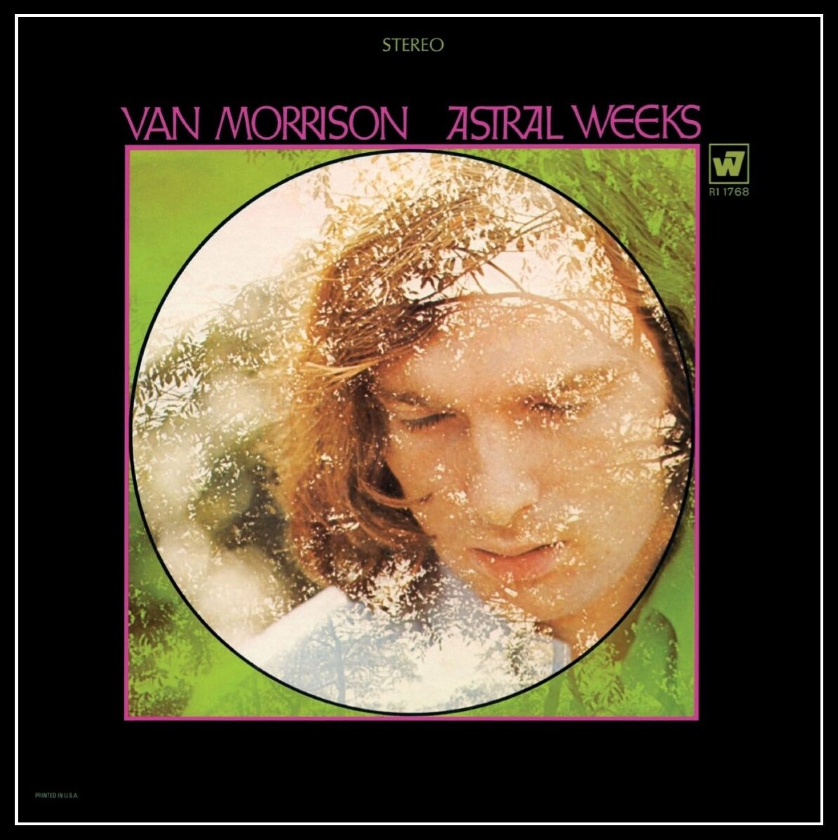
I was not yet in kindergarten in 1968 when Van Morrison’s Astral Weeks was released and failed to reach the Billboard 200 album chart. It was over a decade later that I, browsing in a Tower Records store, decided to purchase my first LP by him. Of course I knew “Brown Eyed Girl,” “Moondance,” “Domino,” “Wild Night,” “Wavelength,” and others, but it was Astral Weeks, an album with which I was completely unfamiliar, that I bought – I’m not sure why. Maybe it was the cover, with its attractive leaded-glass-window-like design and double exposure photograph of sunlit trees and a now-impossibly-young-looking Morrison. Maybe it was the evocative title or the “In The Beginning” and “Afterwards” designations for the sides. Maybe it was the poetry – the lines of jazz and blues, of flowing streams of consciousness, of snow, of a ballerina – on the back cover. Whatever prompted my choice,1 the decision has served me well; although I wouldn’t necessarily cite Astral Weeks as my favorite album, it is up there on the list and could very well be the one I’ve listened to the most in my life.

Van Morrison: Astral Weeks; Warner Bros. Records (1968).

Jay Berliner, Richard Davis, Connie Kay, Warren Smith Jr.: these names didn’t mean anything to me back then – jazz, even now, is a genre I don’t know much about; at that time, I knew next to nothing – but it was obvious that what these cats played was so germane and so inspired that it seems the whole ensemble had gone, as Morrison would soon put it, “into the mystic.”2 I’ve read that Morrison would record his guitar/vocal take and the musicians would improvise their parts minutes later, after which Morrison would move on to the next number.3 The songs themselves are stunning – half of them clock in at well over six minutes, allowing a gradual unfolding of emotion, of compassion, of vision. Morrison’s performance is, of course, breathtaking; his idiosyncratic phrasing, so much a part of his style, transforms the words into sounds that are by turns exultant and heartbreaking.

These days, the music to which I paint is almost always either classically-based “new music” or in an ambient vein, but until relatively recently, much of my work time had been spent in the company of Astral Weeks. It made an indelible impression on me during the years just prior to my beginning to paint and has provided untold inspiration since then. Although I don’t believe I’ve ever used imagery taken directly from any of the songs, Astral Weeks informed my burgeoning aesthetic by revealing that grace and redemption could be found in life’s often overwhelming moments of darkness and despair. Dry your eye.


1 It was not Lester Bangs’ insightful essay on the album, “the rock record with the most significance in [his] life….” I wouldn’t read those thoughts until years later, when Psychotic Reactions and Carburetor Dung; Alfred A. Knopf (1987) was published.

2 Compare the Astral Weeks recordings of “Beside You” and “Madame George” to the earlier Bang Records versions, first released in 1973 on the T.B. Sheets album, for an illustration of what they contributed.

3 John Payne, on flute and soprano sax, played in Morrison’s contemporaneous live band and was the only musician present who had heard the songs prior to the sessions.  

I’m not quite sure how I became aware of the work of Ivan Albright. I may have seen an article about him in a back issue of Art in America, I could have discovered him through Katherine Kuh’s The Artist’s Voice: Talks with Seventeen Modern Artists,1 or it’s possible the monograph by Michael Croydon caught my eye at the library and I picked it up.2 In any case, it was the large format, vivid reproductions and abundance of details of the paintings in the latter book which compelled me, starting in the late 1980s, to check it out two or three times a year until the mid-’90s, when I was finally able to purchase a copy.

Albright had artistic forebears in Expressionism – although his figures’ forms are much different than those of Oskar Kokoschka, Egon Schiele, and Max Oppenheimer, they exhibit a similar physical and psychic vulnerability. Albright, however, achieved these results through radically different means than those artists, as well as from anyone else. His meticulous technique, with which he often completed less than one and a half square inches of work per day, produced dense compositions of aged flesh, decrepit environments, and claustrophobic atmospheres. Albright’s work creates a feeling of passing time and revolving space – the surfaces crawl and undulate, and the objects float, rotate, and fall. The figures have preternaturally old, microscopically detailed skin under which one can feel every sensitive nerve. These aspects imbue the work with mystery, and, while disorienting, ultimately foster compassion for the subject.

There have been at least two Albright museum shows since I’ve been familiar with his work – the eponymous 1997 general survey, a major exhibition for which there is a lavish catalogue;3 and the more focused and tantalizingly-titled Flesh in 2018. Both were organized by the Art Institute of Chicago, which has the largest collection of Albright works in the world. Unfortunately, I didn’t know about either until after each show closed.4

During the late ’90s, a good friend of mine was in the Bachelor’s program in studio art at UC Davis. One of her fellow students was living with or married to a young man who happened to be Ivan Albright’s grandson. My friend, knowing what a fan I was of Albright’s work, was thoughtful enough to wrangle an invitation to their home for me, and the four of us spent a lovely evening together. They prepared a nice meal, we talked about art, we listened to the Abba Gold compilation. After dinner, I was shown a portfolio of Albright’s lithographs and a bronze portrait sculpture.5 I believe all the prints I saw were based on images he’d previously used for paintings. Since Albright’s singular vision draws its strength not only from his imagery and technique, but also his use of saturated color, the black and white lithographs lack the idiosyncratic power of the canvases. However, his draftsmanship is impressive, and even in monochrome, his subject matter continues to be striking. My favorite of the pieces I was shown, a 1947 self-portrait, was also – perhaps not coincidentally – the most heavily detailed and varied in texture; in it, Albright sits in a painstakingly carved wooden chair before a lace-covered table set with a still life. Of the prints I saw, it came closest to capturing the oppressive feel of the paintings.

I subsequently did not spend any more time with the couple, but am still, all these years later, grateful for the hospitality they showed me. My friend has moved several times since then, to several different cities. I haven’t seen her for quite a few years now, although we do exchange the occasional letter, card, or email. That evening remains the single time I’ve seen actual work by Ivan Albright, who passed away in 1983 at age eighty-six, before I had ever heard of him.


1 Harper & Row (1962).

2 Although Ivan Albright; Abbeville Press (1978) is eye-catching – it measures 15 1/2” x 12” x 1 1/2”, it isn’t so easy to pick up – it weighs in at over 7 pounds, 2 ounces.

3 Ivan Albright; AIC/Hudson Hills Press (1997).

4 I’m often on the frontage road of the information superhighway.

5 I also saw a painting which I recognized as being the work of Ivan’s father, Adam Emory Albright.

I was on summer vacation from school, home alone with the TV on. A pre-teen, I didn’t know I was watching one of the most celebrated movies of all time, nor did I know the controversy it had caused.1 Nevertheless, I was riveted by the structure of the story – how it jumps around in time, how it is told from multiple points of view. I’ve seen Citizen Kane many times since that Saturday afternoon; it became one of my favorite movies, one I can watch over and over again. I can also put on the DVD while busy with something else and be guaranteed that for the next two hours, I can look up at any time and find what I see and hear to be engaging in any number of ways.

Citizen Kane is a cautionary tale of the potential dangers of power and the ultimate consequences of megalomania. The screenplay by Herman J. Mankiewicz and Orson Welles is superlative, full of great lines and scenes; Mr. Bernstein’s account of seeing the young woman on the ferry – “… A white dress she had on. She carried a white parasol. I only saw her for one second…” – is perhaps my favorite sixty seconds of movie dialogue, ever.

However, what I like most about the film is the look of it, its striking atmospheric quality. I don’t know much about film history, but from what I understand, American movies changed visually in the wake of Citizen Kane. Some of the highlights are showy – the camera going through the neon sign and into the skylight of the El Rancho nightclub; Susan Alexander Kane’s opera debut during which the camera is on her, then follows the shadow of the curtain going up and continues rising until it reaches two stagehands on a catwalk high above the stage. Although shots such as these are some of the most immediately arresting of the film, most of my favorite moments are much more subtle.

  • In the opening sequence, one sees the grounds of Xanadu, Kane’s San Simeon-like estate. From the front gate, through several shots as the camera gets closer and closer to the mansion, Kane’s lit bedroom window, no matter from what distance or from what angle it is viewed, always occupies the same location in the upper right of the screen.
  • In the News on the March newsreel segment, Charles Foster Kane, Emily Monroe Norton Kane, and Charles Jr. are shown in a newspaper photograph while the voice-over tells of the latter two’s deaths in an automobile accident. Much later in the film, after Kane’s speech at the political rally at Madison Square Garden, one sees this photo being taken.
  • In the picnic scene, Kane and Susan are arguing in the tent, and he slaps her. She looks up, her face hardened, and says, “Don’t tell me you’re sorry.” His reply is a deadpan “I’m not sorry,” and as the shot dissolves into the next scene, her left eye turns into an eye in the design of a stained-glass window at Xanadu.2

I’d probably watched the film at least half a dozen times before I noticed these details, but have relished them each time I’ve seen it since.

The screen-filling screeching cockatoo is a decidedly unsubtle moment, one which is both aurally and visually jarring. In This is Orson Welles,3 the book of interviews conducted by Peter Bogdanovich, Welles claimed it was simply a startling, dramatic effect placed late in the picture to wake up any dozing audience members. I’m certainly not a dedicated cinephile – I would barely describe myself as even a casual moviegoer, but I do have a theory about this particular shot. In Jed Leland’s flashback, he tells of the first time Kane and Susan met. That evening Charles entertained her by, among other activities, making a hand shadow puppet, which she guessed to be a giraffe or an elephant. In response, he chuckled, “It’s supposed to be a rooster” – it’s a lighthearted moment, one of the very few in the film where Kane seems happy. The cockatoo appears in the butler Raymond’s remembrance of the day Susan flew the coop, so the birds bookend the relationship, the ending of which left Kane a completely broken man.

I don’t know that Citizen Kane has directly influenced my painting, although, looking at the three stills above, one does wonder. The story itself is not inspiring at all – Charles Foster Kane quickly lost any artistic vision or creative impulse he may have possibly once possessed – but the manner in which it’s told certainly is. Like other notable works to which I was exposed at a young age, I think in Citizen Kane I recognized perhaps the most important concepts a prospective artist can contemplate – ambition and possibility.


1 Before the 1941 release of Citizen Kane, gossip columnist Hedda Hopper told William Randolph Hearst it was about him. Hearst contacted Louella Parsons, his own Hollywood gossip columnist, and ordered her to screen the film. After doing so, Parsons told Hearst that Kane was a thinly-veiled hatchet job on him. An infuriated Hearst banned any mention of the movie by his media empire, and publicly attacked director Orson Welles. In an attempt to avoid Hearst’s wrath from coming down on the entire industry, MGM chief Louis B. Mayer, on behalf of the top Hollywood movie moguls, offered RKO Radio Pictures more than the full production cost of the film so they could burn it. When that failed, the major studios refused to let Kane play in their theaters, so it couldn’t be widely seen – it lost money and was exiled to RKO’s vault until the mid-’50s. I’m sure that as I sat in front of the television that day, I was only aware of the name William Randolph Hearst because I had heard it on the news in 1974, when his granddaughter Patty was kidnapped by the Symbionese Liberation Army.

2 My old friend Chris B. studied film and was much more knowledgeable than I on the subject of Citizen Kane. He was the projectionist for a college film class, and each semester would provide me with a schedule so I could sit in on any of the screenings. I would always make time on the day Kane was shown – although VCRs were then becoming popular, I wouldn’t have one until well over a decade later, so I didn’t have many other opportunities to see it. He once asked me about my favorite parts in Kane and was surprised I had noticed the stained-glass eye; it was one of his favorite images in the movie, as well. Sadly, Chris passed away in 2001, shortly before his thirty-seventh birthday. We’d known each other for over twenty years. 

3 Jonathan Rosenbaum, editor; HarperCollins (1992). My copy is the revised Da Capo Press edition (1998). The collection is a fascinating look at Welles’ life, art, and insights into a multitude of other subjects. If nothing else, it proves that he was much more than the man behind the War of the Worlds radio broadcast and Citizen Kane, which he didn’t even consider his best film. I haven’t seen a lot of them, but think in addition to Kane, The Stranger and Touch of Evil are especially notable.

A few months ago, I had the opportunity to view five Andy Warhol screenprints from his Myths series, which includes images of The Shadow, Santa Claus, Mammy, Howdy Doody, Uncle Sam, The Witch, Superman, Dracula, The Star, and Mickey Mouse. The portfolio is notable in his oeuvre in that, with the exception of the few comic strip panels he painted when he first started using popular culture imagery, I believe they are the only fictional characters he ever depicted. My two favorites in the series are The Witch and The Shadow; the former is formally the most successful of the ten, the latter is reminiscent of his earlier work, and was recently among the pieces carefully removed from a drawer and placed before me, unframed and 

immediate. I had a sharp intake of breath upon seeing The Shadow; with its deep red and icy blue palette, with its dramatically-lit face and stagy silhouette which fills the majority of the picture plane, it is a striking image, for which Warhol himself served as model. Who knows what evil lurks in the hearts of men?

Eggs on Plate (1982).

In the autumn of 1981, in the local paper I saw a Weinstock’s department store insert announcing an upcoming appearance by Andy Warhol as part of their The Art of Giving holiday advertising campaign, of which the Myths portfolio was an integral part. At the time, Warhol occupied quite a bit of my brain space; I’d recently read Popism: The Warhol ’60s,1 and found the whole Factory scene terribly romantic in a seedy, amphetamined sort of way. It also seemed long ago and far away – it’s amazing to me now how recent it had actually been. Warhol had painted his seminal Campbell’s Soup Cans, the 32-panel polyptych which made up his first gallery show of Pop work, less than twenty years prior; and it had been only a little over thirteen years since he’d been shot twice and pronounced dead, which definitively ended that period – the “crazy, druggy,”2 open-Factory-door-policy period – of his career. Although I was very young when the ’60s came to an end, many of my cultural reference points were and continue to be from that time: the British Invasion, the Mercury/Gemini/Apollo missions, Haight-Ashbury, the Civil Rights movement, Silver Age comics, Swinging London, Pop Art. These were not common interests among people my age, who at the time were collectively frothing over REO Speedwagon’s Hi Infidelity, the Rubik’s Cube, and who shot JR.

In any case, I was a Warhol obsessive and his Weinstock’s appearance was an occasion I wasn’t going to miss. On Saturday November 14, a date sadly missing from The Andy Warhol Diaries,3 my older brother and I caught a bus going downtown and journeyed to the department store, where a line had already formed by the time we arrived. This was the first time I saw actual work by Warhol, as all ten prints were being exhibited in the store. Copies of the current issue of Interview magazine were distributed to attendees, and a woman circulated with a tray of chocolate-covered cherries, as if she were serving hors d’oeuvres at a cocktail party. When we got to the table where Warhol was seated, I was too much in awe to say much of anything while he was signing my Myths leaflet; nevertheless, seeing him was a real moment for me. My brother, for his part, handed Warhol a newspaper clipping and asked him if he would put his teeth marks in it. Warhol turned and whispered to Bob Colacello,4 who was standing by his side and leaned over to hear Warhol’s query. Colacello pointed to his own mouth and dutifully repeated the request, which the amused Warhol denied, then signed the paper and handed it back to my brother. We left the store and rode the bus back to the suburbs, far from the reality of the Factory, but close enough to bask in its mythology. That was the only encounter I ever had with Warhol; he would die just over five years later, following a gallbladder operation. He was fifty-eight years old.

It’s been four decades, almost to the day, since that particular trek to Weinstock’s, and in those intervening years, I’ve probably seen more actual work by Warhol than by any other artist. My favorite pieces tend to be from the 1960s, although he continued to do work I love through the ’70s and ’80s. The Myths portfolio doesn’t rank among his strongest – much of the depth and power in Warhol’s work was derived from his ability to create images which not only distilled the culture of the time, but did so in such a stark and authoritatively factual manner. The Myths look great, but because the subjects are fictional characters,5 they lack the compelling potency of the Car Crashes, the Jacqueline Kennedys, the Most Wanted Men, the skulls, the 1986 Self-Portraits. Despite this, they continue to hold a special place for me in Warhol’s body of work – you never forget your first time.


1 Andy Warhol and Pat Hackett; Harcourt Brace Jovanovich (1980).

2 Ibid, page 285.

3 Pat Hackett, Editor; Warner Books (1989).

4 Interview magazine Executive Editor and later the author of Holy Terror: Andy Warhol Close Up; HarperCollins (1990).

5 Warhol dodged this issue with The Shadow because he does not appear in costume – it can be read as simply a self-portrait.

While pretending to attend community college in the early/mid-1980s, I was enrolled in a drawing class in which the teacher described several of my sketches as “de Kooningesque.” At the time, I had very little knowledge of Willem de Kooning’s achievement, and wasn’t familiar with much beyond Woman I (1950-52) and Woman and Bicycle (1952-53), so I took her remark as a cue to investigate his work. I was immediately entranced by his early 1940s Women series – I loved the push/pull dynamic which results from the blurred distinction between the figure and ground. I loved the juxtaposition of the modeled and the flat portions of the fragmented bodies. I loved the geometric shapes which only minimally suggest interior environments. Although de Kooning subsequently painted many other more celebrated series, those early Women continue to be among my favorites in an oeuvre as rich as any ever produced. I soon became a fan of both his paintings and his drawings from all periods of his career, and over the years have been lucky enough to have seen quite a lot of his work, in both group and solo exhibitions.

The first time I visited what was then the new San Francisco Museum of Modern Art on Third Street was in 1995 to see the de Kooning show The Late Paintings, The 1980s. It was the first time a large selection of the titular work had been seen, and there was much talk about de Kooning’s late ’80s Alzheimer’s diagnosis; how much of a hand his assistants had had in producing the work; and whether the paintings were worthy of being considered part of his oeuvre. It has been over twenty-five years since I saw the show, but I do distinctly remember two specific impressions I had – one: that the paintings seemed to change over the course of the day, going from subtle and elegant to stark,1 and two: while a disease was ravaging his mind, de Kooning was still a better painter than anyone else. The 1980s work comprises an evolving yet coherent period which is the most lyrical of his career – although there are similarities between these paintings and those of other earlier periods, the simplified palette and open compositions make them very different from any of his prior work.

Willem de Kooning: Tracing the Figure show leaflet (2002); Los Angeles Museum of Contemporary Art.

In 2002, I saw the de Kooning drawing survey Tracing the Figure, which included work from the late 1930s to the mid-’50s, at the Los Angeles Museum of Contemporary Art and again at the SFMOMA. De Kooning’s processes of painting and drawing are often indistinguishable – he drew on his paintings and painted on his drawings. In addition to graphite, charcoal, pastel, crayon, and ink, he also used oil and enamel in his works on paper, and in the late ’40s started cutting up drawings to use as collage material. A good portion of the exhibition consisted of work related to his series of Women paintings from the early ’50s, by which time he also sometimes, in a striking Exquisite Corpse2-like manner, fashioned the figure from portions of two or more separate drawings. I was also particularly attracted to the results of the subtractive methods he employed – the smearing and the textured pentimento which remained after he erased sections of the image. Tracing the Figure was not only an extraordinary look at the drawings of a master, but also a comprehensive reference on the techniques of mark-making.

Willem de Kooning put down the tools of his labor for the last time in 1991, about two years after being diagnosed with Alzheimer’s. He passed away on March 19, 1997 at the age of ninety-two. If pressed to name my favorite painter, my answer might vary depending on whose work I happen to be fixated at that particular time. However, de Kooning would always be at least in the top two or three, a position he has held since shortly after I was prompted by a compliment to study his body of work. Thank you, Melinda Barbera.


1 Did the SFMOMA galleries have skylights prior to the re-model? I hope so, because the only other explanation I can think of for this phenomenon – which I’ve never noticed during any other exhibition – is that it was just my imagination running away with me.

2 Exquisite Corpse, or Cadavre Exquis, is a Surrealist game which generates collaborative compositions. The figure is divided into three or four horizontal sections. The first player draws the head and folds the paper to conceal what has been done. The next participant draws the torso and folds the paper again; the process is repeated until the figure is complete.

Sometime during the summer of 1990 my sister, who was then living in San Francisco, phoned to get my take on Jim Dine – I told her I loved his hearts and his robes and his use of real objects in his paintings. She listened patiently to my cursory knowledge of Dine’s oeuvre, then asked what I thought of his figure drawings, to which I responded I didn’t even know he did them.

“You should really get here right away and see this show,” she said.

My sister isn’t generally given to hyperbole, so the first chance I got, I made the trip to see Jim Dine: Drawings 1973-1987 at the de Young Museum. The show was comprised of figurative work, still lifes, and pieces which don’t fall into such neat categories – Dine’s hearts, robes, tools, et al. are images which, even when convincingly modeled, don’t inhabit space in the same manner as objects in more traditional compositions. Although I was attracted to all his imagery, at the time I was pretty much exclusively doing figurative work, so it was that to which I gravitated.

Dine started his career in the late 1950s and early ’60s with performances, installations, and paintings with actual bathroom fixtures and bedroom furniture; but in the early ’70s decided to focus his energy on perhaps the least avant-garde course of action an artist could have taken at that time: life drawing. His intensely-observed works of the human form eventually became aggressively-produced and expressionistic – characteristics which instigated the call from my sister. Dine draws, rubs out, builds up, erases, and reworks images with graphite, charcoal, pastel, acrylic, oil, enamel, and other media. This process results in multilayered works with rich, often distressed surfaces which reveal the histories of their creation. Despite the amount of reworking associated with these drawings, they are not labored or heavy-handed; on the contrary, they appear inevitable. Over the course of three years, two continents, and two different models, in The Sitter Progresses from London to Here in Three Years Dine managed to create a coherent, emotionally stirring and evocative figure which is enveloped by the atmospheric ground in a palpably physical way. The complexity, virtuosity, and diversity of the exhibited work was truly dazzling, and proved Dine to be one of the finest draftsmen in contemporary art.

My sister’s advice couldn’t have been better; seeing Drawings 1973-1987 was one of the most affecting and inspiring art experiences I’ve ever had. It wasn’t that I hadn’t seen heavily-worked mixed media drawings before – I was familiar with those by Willem de Kooning and Jasper Johns, both of whom had done pieces I loved which were so layered they could be considered paintings on paper. It was that I related to Dine’s drawings in a way that I was then unable to relate to those by de Kooning or Johns. Dine’s works aligned so perfectly with my aesthetic, I felt as if he had drawn them especially for me. I saw what could be achieved by disregarding the conventional definition of “drawing” and being open to the possibilities in utilizing any process or medium which would serve the work. Although I had never subscribed to the idea that paper is merely a support on which preparatory works for larger, more important pieces are made, and although I had already begun tentatively using paint in my own drawings, the way I thought about art was transformed. Occasionally, one has an experience and afterward never sees the world in quite the same manner – Drawings 1973-1987 was one of those events for me, one that has enriched my life immeasurably.

Jim Dine is still creating, following his muse. Right now, he is somewhere in the world, painting or sculpting or photographing or printmaking or drawing, making art. I love all forms of his work, but nevertheless, I’d kind of like to think he’s drawing.

“I never considered the Stones drug music. They were the drug itself.” – Patti Smith

All the art that has affected me in any meaningful way has been a psychedelic experience. I don’t mean that it was all drug-induced; I don’t even mean it’s all “hallucinatory.” What I mean is, it has all taken me to unexpected and unfamiliar places, expanded my consciousness, allowed me to view things in a broader or more concentrated fashion. Growing up in the suburbs of Sacramento, I was obsessed with finding new sounds and visions which would bend my mind. Citizen Kane; Bob Dylan’s 1965-66 three-album run of Bringing it All Back Home, Highway 61 Revisited, and Blonde on Blonde; Andy Warhol’s “Death and Disaster” paintings; Animal Farm; the “Penny Lane”/“Strawberry Fields Forever” single; Jasper Johns’ Target with Four Faces; David Bowie’s “Berlin Trilogy” – they have all been milestones in my life.

John Tenniel's drawing of Alice the Red Queen
John Tenniel: “Faster! Faster!” said the Red Queen, from Through the Looking Glass, and What Alice Found There (1872).

Lewis Carroll’s two Alice books certainly belong in this company. I’ve read each probably thirty-five or forty times, and keep coming back to them for any number of reasons, not the least of which is their quotability. It seems one can find an applicable Alice line for almost any situation, an indication of on how many levels the books can work. Alice has been viewed as a socio-political satire, a Freudian study, a hallucinogenic binge, a philosophical treatise. That Carroll himself certainly saw it as simply a children’s story is beside the point. I consider them to be tales of the heroine negotiating her way through anarchic, alarming, ridiculous, lonely, confusing, beautiful environments – in short, as metaphors for life. Contrariwise, they also serve as escapes from the same – they are two of the funniest books I’ve ever read. It was Carroll’s intent not that Alice educate, but that it entertain – this was unheard of in Victorian England, when children’s books were meant only to teach and/or moralize. Carroll succeeded brilliantly in much more than making the books entertaining; what he created 150 years ago was magical, something that even he would manage to equal only once more – when he wrote The Hunting of the Snark.

How Alice has affected my work is difficult to pin down. I’ve done a few pieces which explicitly reference the texts, but the real influence has been much more indirect. Oblique communication is a major theme in Alice; in my work, quotation, reference, and transformation – the subjects of which are generally well-cloaked – play important roles. Many years ago, these books irrevocably altered my thought process – they have contributed to not only the painter I am, but also the person.

In the spring of 1983, I was an eighteen-year-old suburban kid who had acquired a taste for twentieth century avant-garde art. As such, I was excited to learn that the forthcoming Talking Heads album, Speaking in Tongues, would have a Robert Rauschenberg-designed cover that would be available in an edition of 50,000 copies. I quite liked their previous record, Remain in Light, and was already looking forward to the new album, but this news made the release special for me. The record is on clear vinyl and the cover itself is clear plastic. Inside are three clear LP-size discs on which collages are printed in cyan, magenta, and yellow (the three colors which, along with black, are used in four-color printing). The whole package references Rauschenberg’s 1967 Revolver pieces, which feature motor-driven Plexiglas discs, the movements of which can be controlled by the viewer. He didn’t simply design an album jacket, he rethought what it could be.

The first time I saw actual work of Rauschenberg’s was a few years earlier – I was of high school age – during a family vacation. I don’t recall when exactly this was, or even what city we were in, but I do vividly remember wandering into an art gallery and being confronted by his Chow Bags suite of silkscreen/collage prints. I was already a casual fan of his work, which I’d seen only in books – as was the case with most contemporary art with which I was familiar at the time. Seeing the surfaces of these pieces, with the collage elements and plastic twine, was a significant experience and the impetus for me to learn more about his art. By the time Speaking in Tongues was released, I had read extensively about him and had a good knowledge of his career – my admiration was no longer in any way casual. Since then, I’ve seen a lot of his work in exhibitions both large and small, and my esteem for both the artist and the man has only grown.

At the San Francisco Museum of Modern Art during the winter of 2018, I twice saw Erasing the Rules, a comprehensive, career-spanning Rauschenberg retrospective. The exhibition contained work from the early 1950s to 2007, the year before he passed away. His silkscreen paintings, which were executed from 1962-64, were well-represented; they are among my favorite works from an oeuvre which I regard as as important and notable as anyone’s. In these pieces he expanded on ideas he explored in his earlier transfer drawings, but in a medium which could more vividly reproduce the photographs he was using. His juxtaposition of multiple, disparate images, which may have varying personal associations for individuals as well as wider cultural references, creates a poetic evocativeness which I find very engaging. In addition to the screened imagery, Rauschenberg also employed hand-painted gestural marks which hold the flat surface, opposing the three-dimensional illusion of the photographs. Although he is often credited with bringing imagery back into American painting, Rauschenberg was also intent on following the modernist tenet of keeping the picture plane flat. The resulting push/pull dynamic of this juxtaposition was conceptually very important to me while I was developing an aesthetic for my own work.

Rauschenberg continually expanded his artistic horizons, always utilizing new processes and collaborating with different people. This exploratory nature was an abiding aspect of his career, and Erasing the Rules showed his work to be perhaps the most varied and inventive of the twentieth century.

In 1990 I showed my drawings for the first time, at Dito Gallery in Sacramento CA. A few days after the reception, my mother told me about a conversation she had had with a gentleman there regarding one of the pieces, one which depicted an attractive young woman. She also asked if I was familiar with the film Laura; I was not. She told me it was about a police detective who falls in love with a painting of the titular murder victim, and that the way the man spoke about my drawing had reminded her of it.

It wasn’t until several years later, after I was given a used VCR, that I was finally able to see Laura. I’m not really a movie guy; I can be in possession of a DVD I want to watch, and it can sit around for months before I put it in the player. However, there are some movies I like very much and can watch over and over again. Laura, directed by Otto Preminger and based on the novel by Vera Caspary, is one of those.

The conventional but attractive portrait, which is an integral plot device, is actually not a painting at all – a photograph of Gene Tierney was retouched to appear as one. There was a painting done, by original director Rouben Mamoulian’s wife-to-be Azadia Newman, but when Preminger took over the directorial role, he decided it didn’t possess the mystery and allure required, and had Tierney sit for studio photographer Frank Polony. Although I haven’t seen Newman’s Laura painting, I have seen her portraits of Bette Davis and Carole Lombard, which are a bit stilted – it’s obvious why Preminger made the decision he did. In the film, the portrait is the work of Jacoby, one of Laura’s would-be suitors. According to Waldo Lydecker, Laura’s mentor/benefactor, Jacoby is a second-rate artist at best, one who “never captured her vibrance, her warmth.” The painting itself belies this assessment, and calls into question Lydecker’s reliability as a narrator.

Although considered a film noir classic, Laura doesn’t employ many of the genre’s usual trappings – there is a lot of cigarette smoking and some nighttime rain, but very little in the way of skewed camera angles or stark shadows. Most of the scenes take place in lavish, well-lit apartments, not seedy residential hotels; the detective isn’t crooked or cynical, he’s amiable and often plays with a children’s puzzle; Laura wasn’t a femme fatale, at least not in any traditional sense – she was, as Bessie, her domestic, describes her, “a real fine lady.” Her charm and kindness engendered an obsessive dedication in the people who knew her, and her portrait has a similar effect on Detective McPherson.

Some portraits do seem to hold this power: based on Ingres’s stunning 1845 painting of her, I have no doubt that Comtesse Louise Albertine d’Haussonville was a woman I would have wanted to know. It’s one of my favorite portraits – one of my favorite paintings – ever done. I’m not sure exactly what effect my drawing had on the gentleman with whom my mother spoke, but according to her, he was overcome by a certain ardor regarding the woman in the piece. While I don’t think of the drawing as a portrait, per se, it is of a specific person, a captivating young woman with whom I was quite smitten. It was a good likeness, but more importantly, it felt like her; it captured some of “her vibrance, her warmth.” I haven’t seen her in well over twenty-five years, but nobody was rubbed out with a shotgun loaded with buckshot, so I’m one up on Jacoby.