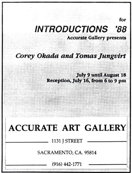
I’m in a crowded museum, at one of those big exhibitions for which one has to purchase a timed ticket. On this particular day, it’s not packed, as such shows often get, but there are a lot of people present. Suddenly, as if on cue, everyone in the gallery where I stand wanders out, and I’m left with Edvard Munch’s Death in the Sick Chamber before me. Inexplicably, for probably three minutes, I am alone in the room and have the painting all to myself; it’s as if I’m in the chamber with the mourners.

Edvard Munch1 is generally thought of in the popular culture, if he is thought of at all, as the unhinged artist who painted The Scream, on which the mask from the slasher movie franchise Scream2 is based. The painting is probably one of the most recognized, and certainly one of the most parodied, images in art history. The poor distressed figure has not only had to endure the precarious mental and physical states of the artist,3 the existential angst of the time, and the burden of representing Munch’s entire oeuvre to most people, but has also been subjected to the humiliation of being forced to hawk cars4 like some late-nineteenth century Cal Worthington.

In 1893, when Munch painted The Scream,5 the piece must have seemed like an open wound – even Impressionism was still considered radical in his home country of Norway. He eventually did five versions of the image – two paintings, two pastels, and a lithograph. I’ve never seen any of those actual pieces, although I have been to two large exhibitions of his work – in 1993, Edvard Munch and His Models, 1912-1944 at the Berkeley University Art Museum in its only US stop; and in 2017, Between the Clock and the Bed, before it traveled to New York and Oslo, at the San Francisco Museum of Modern Art.

The Berkeley show, comprised of Munch’s often-overlooked later work, focused on the six models with whom he regularly worked during the last thirty-two years of his life. The SFMOMA presented a general, career-spanning retrospective. What struck me about both shows was not the absence of Munch’s most well-known image, but how much of what has transpired in painting since Munch’s time can be seen in his work. While perfectly capable of modeling figures and objects in a convincing manner, Munch would often simplify and flatten form, leave portions of the canvas unpainted, apply paint in a sketchy, linear fashion – approaches which disregard the idea of three-dimensional illusion.

Munch’s focus on themes relating to alienation, sex, and death, and his rough and emotionally raw execution of them prefigured the German Expressionist movement. Although Munch showed in several German cities as early as 1892, when his paintings scandalized both the general public and the art world establishment, I’ve read that many German Expressionists denied seeing his work until many years later, after they had developed their mature styles. Some of them are also known to have backdated work, evidently to give the impression that they came to those styles prior to when they actually did, so their claims of not being familiar with Munch’s work can be taken with a whole shaker of salt. At any rate, Munch felt that painting should do more than represent “people who read and women knitting.”

It is not only Munch’s compositional and painting techniques and subject matter which show him to be an extraordinarily forward-thinking artist. He had an outdoor studio where he also often stored his work, allowing the paintings to be exposed to dirt, sun, wind, rain, snow, hail, et al. This attitude relates to concepts which are still controversial today. Contemporary artists who use non-archival materials or mixed-media combinations which are not archivally sound often say they aren’t concerned about how the work will change over time, or that the changing is conceptually an inherent part of the work. This thinking is troubling to museum boards, directors, and trustees, who obviously have a vested interest in the works in their collections being stable. Munch felt the stains, scratches, cracks, mold, and other uncontrolled consequences the elements wreaked on his paintings made the work better. However, he also obviously wanted his oeuvre cared for – when he died in 1944, he left his estate to the city of Oslo, where the Munch Museum opened in 1963, marking the centenary of his birth.

People stroll back into the gallery, breaking me from my reverie. As I leave the room, I don’t know if Death in the Sick Chamber is my favorite painting in the show, but having undistracted time with it without others around is the most moving experience of the day.


1 Pronounced muhngk, not like the sound you make when you’re on the couch with your head in a Party Size bag of Lay’s Sour Cream & Onion Potato Chips. And crumbs all over your sweatshirt.

 2 I’ve never seen any of these movies. I don’t imagine I ever will.

3 “Disease, insanity, and death were the angels which attended my cradle, and since then have followed me throughout my life,” Munch said. He wasn’t exaggerating.

4 Specifically, the Pontiac Sunfire.

5 I understand that the Norwegian title, Skrik, more accurately translates to English as “shriek.”

My love of both visual art and music started very early in life. When I was in kindergarten, three of my favorite songs were “Somebody to Love,” “Paperback Writer,” and “Over the Rainbow.” At that time my parents, with kids in tow, would occasionally make a stop at one of the Tower Records locations in town; when I was a little older, I would venture alone or with my brother to other record stores as well. Starting when I was a pre-teen and continuing for decades, much of my autobiography takes place in the aisles and at the counters of such establishments. In those pre-MTV days,1 the album package itself was the primary visual accompaniment to the songs; one would hold the jacket while listening to a new record – reading the liner notes, looking at the pictures, soaking up all available information about the people who created the music. In the late ’80s, when CDs became the dominant format, the big loss for me wasn’t the so-called “warm” sound of vinyl, but the 12” square piece of artwork.2

One day in 1984, I made a trip to the Beat Records in Sacramento, and came across an album cover which caught my eye. The band’s name – with which I was unfamiliar – along with an abstract logo was emblazoned in green across the top of an arresting black and white photograph of a young man with a shock of dark wavy hair which contrasted with his pale skin; a stylish polka-dot shirt/tie combination; and a hollow body electric guitar, its neck resting on his shoulder. Enthralled, I pulled the record from the rack. The back cover featured another photo of the same young man and the lyrics to a song titled “Savage Earth Heart.” The whole package’s Pre-Raphaelite3 look and feel drew me in. Principal Waterboy Mike Scott actually had the angelic face of a Pre-Raphaelite model, and the printed lyrics touched on God and nature, both of which were Pre-Raphaelite obsessions.

Although I am not, nor have I ever been, in the habit of buying records by bands I haven’t heard – no matter how attractive the cover – it seemed as though I should hear The Waterboys,4 so I slapped down a few bucks for the used copy I held in my hand. When I got it home and on the turntable, I was immediately struck when the needle hit the groove. What I heard had echoes of artists whose work I already admired: Bob Dylan, Patti Smith, Van Morrison; the music was epic – a wall of sound with evocative lyrics and a passionate delivery, all drenched in reverb.5

The Waterboys was not only the record I wanted to hear at that time, but the one I needed to hear. I would have loved the music had it been given to me on a home-taped cassette, but the cover, reminiscent as it was of the late work of Pre-Raphaelite co-founder Dante Gabriel Rossetti, one of my favorite painters, made it all the more compelling. I would soon buy the whole first album, which was eventually released in the US, and their second, A Pagan Place. In late 1985, an advertisement in, I believe, Spin magazine for their third, This is the Sea, prompted an immediate run to the record shop. It, too, had a notable cover which recalled the Pre-Raphaelites, this time by celebrated photographer Lynn Goldsmith.

For their first three albums,6 The Waterboys shared with Rossetti an ambitious, romantic, hallucinatory quality which aligned with my musical as well as my visual aesthetic and that I would attempt to capture in my work. During those long mid-’80s hours in the studio while I was finding my feet as a painter, The Waterboys were in heavy rotation, urging me on.


1 I never had cable television or access to MTV; probably just as well.

2 I did also miss the break between side one and side two of an album.

3 The Pre-Raphaelite Brotherhood was a group of young, idealistic, nineteenth century British artists. As the Victorian-era avant-garde, they were met by severe opposition from contemporaneous critics, who on the whole found the work assaultive and vulgar.

4 Island Records (1984). Unfortunately, there is no photography credit on the jacket. However, it has been reported that the distinctive logo, which resembles chromosomes and symbolizes water, was designed by one Stephanie Nash, Island Records employee.

5 The five songs on the record turned out to be from the band’s first UK album; this “abridgement” was their American debut. At the time, record labels would sometimes test the waters, so to speak, with the “mini-LP” format before releasing a full album by a new band.

6 The fourth album, Fisherman’s Blues, was a simply recorded, largely acoustic affair – quite a departure from what came before, but engaging in a whole different manner.

In 1987, I had been painting for several years and had developed a process and a style which was artistically satisfying for me. The work was all figurative, although sometimes it was difficult to decipher how the forms made up a human body; the paintings were relatively large; the models almost exclusively female; and the palette generally high contrast and very colorful. Although I now think the work was fairly sophisticated for my age, the thought of approaching a gallery did not occur to me; it had, however, crossed the mind of someone else. The young woman with whom I was living had made a few calls, scheduled an appointment with Accurate Art Gallery, put three canvases in the back of her red Chevrolet Sprint, and went off to peddle my wares, all without my knowledge. I don’t know what I would have thought had I known – probably that no one would give them a second look.

As it happened, Accurate’s gallery director was interested and wanted to keep the three pieces to hang. The first time I saw my work there, through the window one night when the gallery was closed, I became nauseated. It wasn’t that I was concerned about what people would think of the paintings, or even that I thought people would know something about me because of them. I can’t explain it, except to say the experience made me feel exposed and vulnerable and sick to my stomach. Nevertheless, I did accept their offer of a show, which during the summer of 1988 would be part of Introductions, an event for which twenty galleries in Sacramento and Davis would present artists exhibiting for the first time.1

For the next several months, I painted without really thinking about the show. I imagine I must have felt some pressure from needing to produce, but I don’t believe that was a real issue for me. I grew to enjoy seeing my work hanging at Accurate, which was located in the Masonic Temple in downtown Sacramento. It was a beautiful gallery, certainly one of the largest and nicest in town.2 I thought my paintings looked good in the space, but as the show neared, I began to feel anxiety regarding the whole endeavor.3

When I had finished seven paintings and the show was finally hung, my mother, along with a friend of hers who’d known me my whole life, went to the gallery. While they were viewing the work, the attendant approached them and asked if they were enjoying the show. They replied in the affirmative, and he informed them if they attended the opening reception, they would be able to actually meet the artist. My mother shrugged and said, “Eh, no big deal,” as her friend chuckled to herself.

Just prior to the big night, I asked my sister if she wanted to attend as “Corey Okada,” and do the mingling for me. She refused. She did end up going, as herself; in fact, much of my family, including my mother, was there to support me. It was good to have them and some friends, along with my better half, without whom the show wouldn’t have happened, present, but they couldn’t run interference for me. I had to talk to a lot of strangers, and it was difficult to have them question me about the paintings. Back then, I had absolutely no experience in dealing with potential art buyers or in speaking about my work. I wasn’t trying to be difficult, but I did simply refuse to answer some queries.4 I don’t remember much else about the three hours of the reception itself, although I was relieved when it ended and we went to dinner at Fuji, a Japanese restaurant my family had frequented since I was a child.

The show went on to become a success. Not only did I survive the opening, but five of my seven pieces sold. Over the years, I have occasionally run into the former director of Accurate, and he has told me how much everyone there was excited by that first exhibition, and how satisfying it was for them that it sold well. Looking back, it took a few shows before I could really enjoy a reception, but even so, those few years were an exhilarating time for me.

Only a couple months after the show ended, the gal and I parted company and she moved out of our midtown apartment where, in the back room, I had painted all the work. In 1989, I had my second solo show at Accurate, which would soon close up shop. Almost all of the twenty galleries which took part in Introductions ’88 are long gone, as is the Japanese restaurant.

My ex went on to open her own gallery, where I currently exhibit my work. The stress I now feel prior to a solo reception is minimal; I can have a good time talking with both friends and strangers. I do, however, still have to sleep a lot the next day, and that has nothing to do with how much champagne I may have consumed the previous evening.


1 Outside of school, my work had been shown in public only once before, at the Crocker Art Museum’s Sixty-Second Annual Crocker-Kingsley Exhibition in the spring of 1987. I really don’t remember anything about the show or even the reception, except for the slinky white ribbed dress my better half wore that evening.

2 The space is now occupied by a deli. So it goes.

3 Around this time, my friend Michael suggested I write down my thoughts, because I’d only have one first show. Unfortunately, I didn’t take his advice – I had no idea that almost thirty-five years later, such a document would be helpful in writing a blog post.

4 All these years later, this still occasionally occurs.

In my mid-twenties when I started showing my work in galleries, Gustav Klimt was perhaps my favorite painter and almost certainly my main influence. My introduction to him was Charles Wentinck’s book The Art Treasures of Europe,1 which I received as a gift well over ten years prior. His painting reproduced therein was a revelation to me – at that young age, I was not familiar with the story of Salomé and John the Baptist, nor had I ever seen a painting so sultry, provocative, and unnerving. I’d seen a lot of nudes – there are plenty in Wentinck’s book alone – but Salomé doesn’t depict a woman simply bathing or lounging on a divan; she’s grasping a man’s decapitated head by the hair. Both the image of Salomé and the painting itself are dynamic and aggressive, and played a major role in the development of my painting aesthetic.

Forty-five years later, I’ve seen actual examples of Klimt’s work on only one occasion, at the Klimt & Rodin show at San Francisco’s Legion of Honor in early 2018. One of the paintings exhibited was Nuda Veritas (“naked truth”), which depicts a life-size, full-length standing nude. Veritas, the Roman Goddess of Truth, was traditionally portrayed in a classically idealized manner, but Klimt painted her as a contemporary woman. This immediacy prompted many critics to proclaim the piece pornographic, but Klimt had truth on his side.

I would like more opportunities to see Klimt’s work, and want as much of it as possible to be available for viewing by the public now and in the future, so I obviously don’t want anything to befall any more of his paintings.2 Unfortunately, something recently did happen to a Klimt piece – two members of Last Generation, the “environmental protest group,” attacked his Death and Life at the Leopold Museum in Vienna. The painting and the frame are protected by glass, on which Halfwit 1 threw an unidentified black substance and to which Halfwit 2 glued himself. This was not an isolated incident; there have been similar “protests” by other groups in England, Germany, Italy, the Netherlands, Norway, and Canada. Other artists whose work has been targeted include Raphael, Johannes Vermeer, Francisco Goya, Claude Monet, Vincent Van Gogh, Edvard Munch, Emily Carr, and Pablo Picasso. If these “protests” continue, they will almost inevitably escalate, and it’s only a matter of time before a painting is destroyed. If that happens, individuals may be reluctant to lend artwork they own to museums, and institutions may refrain from letting their work out of their possession for extended periods for traveling exhibitions.

I’m all for saving and protecting the environment – I find Greta Thunberg an articulate, inspiring young woman. She knows that intelligent discourse, peaceful protest, and education are the means to get people who may be sympathetic to her cause to think about these issues. She knows the urgency of the environmental crisis the world is in but realizes the situation cannot be rectified overnight. She is a nuanced thinker and knows solutions are not simple. She is someone for whom I have a great deal of respect, and she has truth on her side.

On the other hand, I’m not sure which side groups like Last Generation are on, or what they think they’re accomplishing with these acts of vandalism, which often involve the throwing of food; it’s as if their demonstrations are conceived and organized by John Blutarsky. Greta Thunberg they are not. Gustav Klimt they are not.


1 Simon & Schuster (1974).

2 Klimt’s “Faculty Paintings,” PhilosophyMedicine, and Jurisprudence, were destroyed in a fire set by retreating SS cretins in 1945.

In the early 1990s, advertising mogul and London gallery owner Charles Saatchi began to sponsor members of a loosely-knit group of recently-graduated art school brats who would become known at the YBAs – Young British Artists. In 1997, Sensation, a group YBA show of work from the Saatchi collection was mounted at the Royal Academy of Art, London, and two years later, after a stop in Berlin, a version of the show was exhibited at the Brooklyn Museum of Art. Noted art expert Rudy “Lapdog” Guiliani, then mayor of New York City, made deriding comments filled with righteous indignation regarding the show, specifically Chris Ofili’s painting The Holy Virgin Mary, and attempted to evict the museum from its space and withdraw its funding. In addition to the expected art world ink, the story was picked up by the general press, few of whose members seemed to have actually seen even a photo of the piece in question, as it was often described as being “smeared” or “splattered” with elephant dung, which was not the case. It’s always fun to see professional wackjobs frothing at the mouth about the latest artwork that’s going to bring about the downfall of Western civilization; however, political baiting aside, most of the work in Sensation was not really up my snicket.

I thought some of the YBAs – e.g. the aforementioned Ofili, whose work I considered fairly innocuous; Jake & Dinos Chapman – were not particularly interesting at all, and found others – e.g. Tracey Emin, Rachel Whiteread – to be intriguing conceptually, but not so much in the formal sense.1 The sole member of the group whose work I found really engaging was Jenny Saville.2

Saville was only twenty-three years old and already an accomplished painter when she first showed her photographically-based outsize canvases of outsize female nudes. Her work existed in the face of all the “male gaze”3 figurative paintings of art history, as well as the trendy heroin chic fashion photography of the day. Saville’s feminist approach often leads critics to give the work what I feel is an overly-conceptual reading. First and foremost, she is a painter, one whose lush depictions of human flesh indicate she is just as obsessed with the subject as was Francis Bacon or Rembrandt, both painters whose work I’m sure she has studied extensively.

One of my favorites of her early work, Propped, depicts a large woman4 sitting atop a stool. The seven-foot-tall canvas, the low angle perspective, and the dramatically foreshortened legs accentuate her size as she looks down on the viewer. Feminist writer Luce Irigaray’s words “If we continue to speak in this sameness – speak as men have spoken for centuries, we will fail each other…”5 are scored into the picture plane in mirror image writing, as if they are for the figure in the piece, not the audience. It is an extraordinarily sophisticated work for such a young artist to have executed, and was what convinced Saatchi to offer to become Saville’s patron and commission her to spend two years working on pieces to be shown at his gallery.

Since the ’90s, Saville has continued to evolve as a painter. Her color palette is now more varied and vivid; her paint handling more vigorous – the brushwork, like Bacon’s or Frank Auerbach’s, often seems to bear no relation to the form it represents, although unlike those artists, she maintains a credible human anatomical structure. She also employs completely abstract de Kooningesque passages and often draws on canvas with charcoal and pastel, giving the paintings a more active and layered surface. She continues to focus on the human form, and has expanded her subject matter to include pregnant women, babies, children, and transgender men and women.

For decades, probably since the advent of photography, there has been talk of “the death of painting.” It hasn’t happened yet, and it’s not going to happen on Jenny Saville’s watch.


1 To be fair, especially to Whiteread, I have seen work by most of the YBAs only in reproduction.

2 Those of you who were hip kids in the 1990s will recognize Saville’s work from the cover of the Manic Street Preachers album The Holy Bible; Epic Records (1994).

3 In feminist theory, the “male gaze” refers to the depiction of women as sexual objects for the benefit of a straight male audience. I suppose some of my work could be seen through this lens, although I think the artistic concerns have always outweighed any objectification, actual or perceived.

4 The figure has Saville’s face, although I do not know if she considers Propped to be a self-portrait.

5 “When Our Lips Speak Together” from Signs; University of Chicago Press (1980).

My first favorite artist was Rembrandt van Rijn. Apparently, even as a young child, I didn’t fool around; I just went with the best. I remember being awestruck by The Night Watch when I was about five years old – at that time I probably didn’t know the word epic, but I did know that this painting had to be bigger and better than anything else in the world.

I became familiar with The Night Watch when an aunt gave me the book The World of Rembrandt.1 I don’t remember if I already knew who he was when I received the book, but afterward I thought Rembrandt must be the greatest painter to have ever lived, and The Night Watch was obviously his masterpiece. There are three full-page details of The Night Watch in the book; I would just sit and stare at them – I was amazed that someone could actually make such a thing. It’s a monumental painting, with sixteen near-life-size figures of the militiamen who commissioned the piece, plus fifteen “extras” whom Rembrandt added to the composition.2 One of these “extras” is probably my favorite figure in the painting – a young girl, a dead chicken tied to her waist, scurrying through the scene. I have no idea why she’s there, and I certainly don’t know why she has the fowl, but I do know she was not a random addition. The way she seems to glow makes her as much a focal point as the two main figures in the middle foreground.

At that time I definitely didn’t know the word chiaroscuro, but I did love the deep shade and brilliant light in The Night Watch. While the rest of the company is in varying degrees of shadow, the captain and his lieutenant – quite the dandy in his feathered hat, yellow brocade jacket, and sash – almost seem to be under a spotlight. In a piece filled with texture, the lieutenant’s sartorial elegance, along with the way he is lit, provides the brightest and showiest details. The manner in which Rembrandt depicted light and shadow does not always necessarily make strict literal sense, but the power of what he invented is undeniable.

Despite the book’s black and white reproduction, The Slaughtered Ox became another favorite. As a child I was fascinated by skeletons,3 and Rembrandt’s Ox is perhaps the most visceral depiction of flesh and bone I’ve ever seen in a painting. The sheer mass of the animal, hanging suspended by its hind legs from a large wooden frame, is palpable – I could feel the weight of the carcass, as well as the dank atmosphere of the room. Whether or not it was intentional, Rembrandt’s treatment of the subject is much like that of a crucifixion – a startlingly modern take for an artist working in the seventeenth century. This piece was also almost certainly the first in what for me would become a long line of beloved paintings with untraditional subject matter.4

At that young age, drawing was already all I wanted to do,5 and as a result of the book, I knew I also wanted to paint, and I wanted to paint like Rembrandt. I still kind of do, although when I eventually did start painting I never attempted to emulate Rembrandt’s work.6

Over the years, many artists have become important to me, but Rembrandt has remained my favorite pre-nineteenth century painter. Although I continue to find The Night Watch an enormous achievement in art in general and group portraiture in particular, I would no longer cite it as my favorite Rembrandt painting. Since my late teens or early twenties, I’ve had a preference for his more intimate work, especially the self-portraits, of which he did many. One can follow him from the time he was a young man through the last year of his life, when he died at sixty-three. Rembrandt was not a classicist; he painted real people, not idealized figures, and in his self-portraits he did not abandon this tenet. Although his late religious paintings are often considered to be his strongest work, I believe his self-portraits to be his main contribution to art history. Neither his eye nor his hand wavered; Rembrandt documented his aging process in a more detailed and perceptive manner than perhaps any other artist ever.

After all this time, The World of Rembrandt still occupies a space on my bookshelf. I never got peanut butter and jelly on it or dropped it in the bathtub. I don’t look at it as much as I once did, but when I do, Rembrandt still seems like the greatest painter to have ever lived, and the book seems like one of the best gifts ever. Thanks, Joyce.


1 Robert Wallace; Time-Life Books (1968). She also gave me two other volumes from the Time-Life Library of Art series – the Van Gogh and the Titian – neither of which I liked very much. In time, I came to appreciate Van Gogh; Titian still leaves me a little cold.

2 Three figures, including two members of the company, were lost when in 1715 the painting was cut down to its present size. Yes, cut down to its present size. This fact does not appear in The World of Rembrandt; if it had, I would have been aghast.

 3 I also loved x-rays and other types of scientific imagery, including the photos of the moon taken by the Apollo astronauts, topographical maps, those clear plastic overlays in anatomy books, et al.

4 When I was a teenager discovering the work of Francis Bacon, including Painting 1946 with its butcher shop imagery, I’m sure it fell within my sensibility and was accessible to me at least in part because of my knowledge of the Rembrandt piece. Interestingly, I recall Bacon being quoted as saying he didn’t particularly care for The Slaughtered Ox – he felt it looked as if were made of wax, not flesh and bone.

 My older brother remembers when he would come home from a hard day at kindergarten, our bedroom floor would often be covered with drawings I’d made while he was gone. I was three years old.

6 I obviously had more good sense than did Van Gogh.

Back in February 2020, I wrote about Wayne Thiebaud and the show 100: Paintings, Prints, and Drawings, which was due to open at the Crocker Art Museum in October of that year. Because of the pandemic, the museum was closed for part of the scheduled run, so the exhibition probably didn’t turn out to be the 100th birthday celebration Thiebaud was hoping for and deserved. During the time one could view the show, I was still sheltering-in-place, and did not venture there. Thiebaud passed away in late 2021, and now, after stops in Toledo, OH; Memphis, TN; San Antonio, TX; and Chadds Ford, PA, the show is back in Sacramento, expanded and under the new moniker Wayne Thiebaud: A Celebration, 1920-2021.

Over the years, I’ve been to several surveys of Thiebaud’s work, but on a recent warm, blustery Saturday, I paid a visit to the Crocker to see what I missed out on nearly two years ago. I’d seen much of the work in previous shows or in the Crocker’s permanent collection, although a good portion of the pieces were new to me. Unfortunately, because of the wind, the surrounding agricultural fields, the fact that Sacramento is in a valley, and my overly-vigilant, histamine-releasing immune system, I was sneezing so much I had a hard time focusing on the work. I spent about an hour and a half in the galleries before I gave up, went home with red eyes and a runny nose, and crashed on the sofa with a box of tissue.

My second excursion to the show was much less allergen-infused and much more enjoyable. Thiebaud’s work is playful and fun; a less angst-ridden notable oeuvre would be difficult to cite.1 His technique of applying the paint to physically mimic the subject, whether it be cake frosting, ice cream, mustard, or potato salad, is signature Thiebaud, consummate and humorous. Of his paintings, I have a preference for the still lifes, not only the food, but the clothes, the makeup, the tools – objects which are designed to be adornments to or extensions of the human form but are presented in unused states.

It’s simple enough to understand why in the early 1960s, given Thiebaud’s subject matter, he was seen as a Pop artist. However, although his serial pies, cakes, and other foods were certainly related to that movement, time has proven him to be a much more traditional painter than that connection would indicate. As early as the mid-’60s, he tried to get away from the Pop label by painting the figure, which he approached in much the same manner as the still lifes – brightly lit, straightforward depictions in austere settings. His figurative work is most compelling when it most resembles the still lifes, when the figures are static, doing absolutely nothing, engaging with no one.2

In the late 1960s and early ’70s, Thiebaud added landscapes, both rural and urban, to his oeuvre. These paintings were often constructed from multiple viewpoints and contain all the movement missing from his figurative work. People rarely appear, and when they do, they are miniscule. As in Asian landscape painting, with which many of the cityscapes share an exaggeration of verticality, the figures shown illustrate the disparity in size and importance between humans and their environment.

As much as I enjoy the paintings, I have had fairly consistent access to them, courtesy of the Crocker, for most of my life. With the exception of the relatively recent “Clown” series, of which I don’t recall ever previously seeing an example, they no longer hold much surprise for me. Consequently, the highlights of the show were the ink and the watercolor thumbnails – simple sketchbook exercises which show Thiebaud’s ability to quickly capture the essence of an object or the attitude of a figure.

I’ve said before that Thiebaud was almost certainly the first contemporary artist of whom I was aware. I told him that once, and he laughed, as though he didn’t think of himself as particularly “contemporary.” I didn’t know him, although over the years I did have several interactions with him in non-art-related circumstances, and he always seemed like a genuinely nice, low-key person. Godspeed, Wayne Thiebaud.


1 My taste, although quite catholic, veers toward the Expressionist. “Playful and fun” generally does not describe what I look for in a painting.

2 A Thiebaud canvas which I saw for the first time on my second trip to see A Celebration was Supine Woman (1963), which was included in a separate exhibition, Twinka Thiebaud and the Art of the Pose. It could be my favorite Thiebaud figure painting I’ve ever seen.

At the de Young Museum in San Francisco, I recently saw the Alice Neel retrospective People Come First, which is up through July 10, 2022 and is the first large survey of her work to ever be exhibited on the West Coast. Prior to this show I don’t believe I’d ever seen any of her actual paintings, so I was eagerly anticipating my visit, which would be my first out-of-town trip in well over two years, since shortly before the world closed down. I’ve been a fan of Neel’s for many years, and it seemed her work, with its strongly humanist approach, would be perfectly appropriate for my reentry into the realm of museum-going, which I have missed terribly.

From the mid/late 1980s to the mid-’90s, I was regularly borrowing Patricia Hill’s monograph Alice Neel1 from the Sacramento Public Library. Neel’s painting of Andy Warhol, which appears in the book, is what initially prompted me to do so. I don’t remember where or when I first encountered the piece, but it was almost certainly my introduction to her work. It is a masterful portrait, capturing Warhol as he was rarely seen – sensitive and vulnerable. I actually find it surprising that Warhol sat for her in this way, without the mask of the “Andy Warhol” persona. Unfortunately, the painting is not in the present show; I would have loved to have seen it, although while at the museum, with so much strong work to see, I really didn’t think about what wasn’t there.

The first painting in the exhibition is French Girl, one of Neel’s earliest known extant works,2 done when she was in her early twenties. It’s a stunningly attractive piece, but Alice Neel’s artistic ambitions went far beyond the creation of attractive paintings. Her expressionist bent; her employment of caricature; and her drive to produce work which would reveal something of the inner life of the sitter – to paint what she considered “truth” – often resulted in images which do not fall into traditional notions of beauty. Neel did, however, imbue her sitters with the dignity she believed they all possessed. Her wide range of subjects included family, friends, lovers, leftist political figures, pregnant nude women,3 art world luminaries, feminist leaders, kids from her Spanish Harlem neighborhood, members of the LGBT community, and a Fuller Brush man who was also a Holocaust survivor. Her intent was not only to paint individuals, but also to document the times; her oeuvre, in a sense, is a portrait of the era in which she worked.

In one of the de Young galleries, near the piece Ginny in a Blue Shirt, a monitor shows a short silent film of Neel working on that painting. Although Neel was a straightforward easel painter, I found the film to be a fascinating addendum to the exhibition. She started by outlining the figure and other parts of the image – what she called “dividing up the canvas” – in thinned ultramarine blue oil paint. It’s a startlingly direct method of working, and as a result the sitters display a remarkable presence in the paintings. Neel developed compositions very quickly and if some aspect needed to be adjusted, she simply repainted it.4 She would then fill in color, modeling some areas while keeping others flat. This representational/abstract juxtaposition is heightened by her practice of leaving areas of the picture plane unpainted, as in Ginny in a Blue Shirt and many other pieces done in the latter part of her career. Viewing the work in today’s context, it still looks contemporary and, in the present socio-political climate, her obvious affection for her subjects makes it feel not only current, but revolutionary.

Alice Neel passed away in October of 1984 at the age of eighty-four.


All artwork © The Estate of Alice Neel.


1 Harry N. Abrams, Inc. (1983). In those barbaric pre-internet-shopping days, I was unable to find a copy for purchase until it was reprinted in 1995.

2 In 1934, much of Neel’s early work – about sixty paintings and two hundred drawings and watercolors – was slashed and burned along with her clothing by Kenneth Doolittle, a controlling boyfriend/opium addict. She believed he would have killed her had she not fled their apartment.

3 Neel’s interest in pregnant women, mothers, and children was probably informed by the loss in 1927 of her first baby to diphtheria and the fact that in 1930, her husband abandoned her and took their second child with him to Cuba.

4 She would often leave the initial, “incorrect” lines evident in the finished work, visually flattening those areas.

Richard Polsky: I Bought Andy Warhol. Bloomsbury trade paperback (2005). Design: Whitney Cookman.
Richard Polsky: I Sold Andy Warhol (Too Soon). Other Press trade paperback (2011). Design: Carin Goldberg.

Back in 2005, I read a book called I Bought Andy Warhol,1 a memoir by art dealer Richard Polsky, who, with his wife Lia, owned a San Francisco gallery called Acme Art. Early in 1987, they mounted a show of Warhol paintings, and on February 22, it was hung but had not yet opened. On that day, they were in Sacramento to buy a small Self-Portrait from 1967 to round out the show. When they got back home to SF with the piece, there were over a dozen messages on their answering machine saying Warhol had died.

Soon after the show closed, Polsky set aside $100,000 to purchase a Warhol not to resell, but for his personal collection. I Bought Andy Warhol is about his search for that painting. It’s a highly entertaining read, very chatty and funny, with a lot of anecdotes about the strange and often ridiculous world of art. At the end of the book, he, now divorced, buys a 12” square green “Fright Wig,” from the 1986 series of self-portraits that I consider to be among Warhol’s most powerful work. Polsky really seems to love the piece, which took him twelve years to acquire. I was happy for him – he bought a great painting and only used half the money he had earmarked to spend.

In 2011, I found out Polsky had a newer book titled I Sold Andy Warhol (Too Soon).2 I was naturally disappointed that, after his talk about the “Fright Wig” being his “ultimate Warhol,” he decided to sell it. Nevertheless, I was intrigued and read the book. Apparently Rachael, his new wife,3 liked to spend a lot of money, and asked, “What would you rather look at, your painting or me?” He sold the painting to placate her. I’m sure she was not without certain charms, but I don’t think I’m going out on a limb by saying he made the wrong choice. The Christie’s auction at which Polsky sold the piece takes place at the beginning of the book; by page 29, he and Rachael are divorced.

Most of what follows is about how prices for blue-chip art escalated at an unprecedented rate in the late 1980s. It is entertaining, but while I Bought… is about art, I Sold… is all about money. It’s no coincidence that while the first book has the Warhol Self-Portrait on the cover, the second cover features the etching of George Washington from the dollar bill. Greed, and maybe fear, made him sell the painting. He says he immediately experienced seller’s remorse and that he had violated the cardinal rule of art dealing: never get emotionally attached to the inventory. He seems to have forgotten the piece wasn’t “inventory,” it was part of his collection, “part of [his] soul.” He sold it.


1 The title is a pun on I Shot Andy Warhol, a 1996 film which I had the distinct displeasure of seeing at a sneak preview with what seemed like an audience/mob of 800 militant lesbians rooting for wackjob Valerie Solanis, who they thought was making some sort of feminist statement by shooting Warhol and art critic Mario Amaya. Being in that theater was truly one of the most unsettling experiences of my life – I have no recollection whatsoever of the movie.

2 It was originally published in 2009.

3 I Bought Andy Warhol is dedicated to her.

Francis Bacon entered my life when I was about ten or twelve years old, via Charles Wentinck’s The Art Treasures of Europe.1 The book includes a full-page reproduction of Two Figures (1953), which I found simultaneously captivating and unsettling. The painting depicts two male nudes in the act of coupling; at the time, I’m not even sure I realized both were men, but a few years later I would learn that the bottom figure is a self-portrait. By the time I graduated from high school I had gained, courtesy of the Sacramento Public Library system, a working knowledge of Bacon’s oeuvre. I would also soon read David Sylvester’s engrossing book of interviews with him – it is a volume which continues to be a fascinating and revealing document of the creative process.2

In 1990, a large general survey of Bacon’s work came to the Los Angeles County Museum of Art. Although he had been an artistic icon of mine for many years by then, I had only seen a few actual paintings and was thus very much looking forward to the exhibition. Unfortunately, because of reasons not really appropriate to go into here, my plans fell through.3 Shortly afterward, I came into possession of the exhibition catalogue and found that Study after Velasquez’s Portrait of Pope Innocent X (1953), one of my favorite paintings ever, had been in the show. It alone would have been worth the trip, and it is to my eternal regret that I did not make it to LA during the exhibition’s run.

In the summer of 1999, the Palace of the Legion of Honor in San Francisco hosted Francis Bacon: A Retrospective, and I was finally able to see a large show of his work. The aforementioned 1953 Innocent X was not part of this exhibition,4 but that was ultimately not a concern – my museum-going companion for this excursion sidled up to me while I was taking in a different pope painting and informed me my mouth was hanging open. “I’d never thought of the term ‘jaw-dropping’ as literal before,” she later said.

Bacon’s varied subjects – the popes; the agitated, solitary, suited men; the biomorphic, often headless forms; the arresting portrait triptychs; the enigmatic, multi-figure tableaus; et al. – were all represented. His turbulent subject matter would be notable even if his technique had been more traditional, but the immediacy of his abstract mark-making in the service of recording that imagery is what gives the work much of its power. His sense of formalism in both composition and presentation – he preferred the paintings be in wide, gilded frames and under glass – adds to this duality of deeply ordered work which appears to have been made largely through improvisational means.

All these years after Bacon’s painting became a formative element in my artistic development, I still find his work viscerally affecting and, with the possible exception of Willem de Kooning’s, perhaps the strongest painting oeuvre of the twentieth century. Francis Bacon died of a heart attack at eighty-two while on a trip to Madrid in 1992. Back in his studio in London’s South Kensington, a canvas sat on the easel,  unfinished.


1 Simon & Schuster (1974).

2 The copy I eventually purchased in the late 1980s was The Brutality of Fact: Interviews with Francis Bacon/Third enlarged edition; Thames and Hudson (1988).

3 Those plans involved an attractive young woman who lived in Los Angeles. With her boyfriend.

4 Study after Velasquez’s Portrait of Pope Innocent X  was exhibited in California in 1999, at San Diego’s Museum of Contemporary Art. I didn’t become aware of the show The Papal Portraits of 1953, which was comprised of twelve Bacon canvases, until after it closed. Maybe one day I’ll make it to the Des Moines Art Center to see the piece and finally put the feeling of missing out to rest. At least concerning the painting.