Field of Fire, my first solo show in quite some time, is opening later this week. My previous exhibition was back in November 2020, and almost all the work for it was done during the COVID lockdown, which was a difficult time for me as a painter. I wasn’t making visual or conceptual connections; working on one piece did not lead to ideas for any further work – with each painting I started I felt as if I were back at square one. I believe this was because, in addition to the overwhelmingly oppressive and physically threatening political climate of the time,1 I was barely leaving the confines of my four walls. With next to none of the sensory input that came with what had been normal life, it became difficult for me to transform thought into expression. This was something I did not anticipate, something that I had never even considered I would have to manage, but something that became apparent early in the pandemic.

Several years ago, I began to utilize actual objects – rivets, a fork, a music box, a tooth in a vial – in some of my work, and when the 2020 show was scheduled, I planned on continuing that practice. Unfortunately, as it turned out, I had a hard enough time putting the show together even without adding other elements. The one piece that did have a sculptural aspect – it included rivets, twine and three Chinese coins – was finished in late 2019, prior to the first reported cases of the coronavirus in the US.

When the vaccine became available, I returned to the world outside, but even so, between that time and when I started working on the present show, I only finished a handful of pieces, none of which had an easy gestation. Last year I did produce a painting that incorporated a 7” vinyl record, although I considered it more of a design job than a piece of art.2

Feeling I had to regain my equilibrium as a painter, I decided not to concern myself with the “painting with objects” idea while producing the Field of Fire pieces – I simply wanted to create a body of work that belonged together, that felt like a show. Fortunately, the ability to tap into those artistic processes which had previously been so natural did start to come back to me while I was working on these current paintings.

Although I began these pieces up to ten months ago, they were all finished this year. Since I always had a few paintings on which I was actively working – something I’d never done before – all the work developed together. Additionally, a major occurrence in my life took place about a year and a half ago, and I found that most of the paintings, even those that don’t relate to that event, are seen through its lens, a perspective experienced by most people my age. I believe that these conditions contributed to the cohesiveness of the work as a whole.

Field of Fire will run from April 4-27, 2024 at Archival Gallery, 3223 Folsom Boulevard in Sacramento, CA.


1 Which, frankly, hasn’t abated much, and is currently ramping up again. Somebody shove a mute in that trumpet, please.

2 The work served as the announcement image for Archival Gallery’s Top 40 anniversary group exhibition.

In the early-to-mid-1980s, in what now seems like another lifetime, I managed a Shakey’s Pizza Parlor & Ye Public House. Back in those days, something one found in most pizza parlors was a cigarette machine.1 These vending machines have been outlawed in establishments where those under eighteen are allowed, in Sacramento since 1991, in California since 1995, and in the US since 2010. The one I saw five days a week in the Shakey’s dining room is probably rotting away in a landfill somewhere. One might think that someone should do something constructive with these heavy, large, unwieldy metal boxes.

Well, someone has. Since 2007, I’ve been working on-and-off with the Art-o-Mat® project. These good folks refurbish old cigarette machines, making them bright and shiny, and artists contribute a wide variety of cigarette pack-size work to stock them. There are paintings, drawings, sculptures, pieces of jewelry, photographs, et al. which are sold for five dollars each2 at museums, galleries, and shops across the country. One puts a token in the machine, pulls the knob which corresponds to the desired “brand,” and fresh art drops like a stale pack of Marlboro Reds.

I just sent in my twenty-first edition of the painted blocks – over the years, more than 1250 of my small pieces have helped fill the machines. My ongoing series, Paintings of Safety & Danger, depicts objects – actual size3 safety pins, safety matches, safety razors, syringes, broken safety glass, pills, and condoms – which symbolize actions which can be seen as either safe or dangerous. I like that the objects are thematically linked in such a subjective manner, and that the title of the series reflects that. However, despite the obvious caveat in that title, some Art-o-Mat® hosts and collectors have objected to the condoms. Consequently, my work is no longer available at some locations where it could previously be purchased, and is now considered R-rated. It’s not exactly Robert Mapplethorpe, but I guess, compared to most of the Art-o-Mat® inventory, it is kind of racy. Still, it’s a sad comment that this far into the twenty-first century, a painting of a prophylactic could cause a fuss. Nevertheless, Art-o-Mat® founder and Main Man Clark Whittington has never asked me to change the series or desist from painting anything. I have appreciated his support in this matter, as the condoms are such an essential part of the series I wouldn’t want to continue it without them.


Art-o-Mat® is for everyone, although the machines do seem to be particularly appealing to children. An interest in art needs to be fostered in order to flourish, and Art-o-Mat® is a perfect way to do that – it’s approachable, inexpensive, and fun. There are plenty of options from which to choose, so give the kid a token and let him or her4 determine what is most appealing. As with the artwork in the museums where many of the machines reside, kids may have questions about some of the pieces one can buy. So, if he/she/they comes to you with a painting of a condom, take the opportunity to have a conversation. It may save you some trouble sometime down the road.


1 They were found in many ye public houses, as well. 

2 Lucrative? Uh… no.

3 For some reason, this is conceptually important to me. I’m actually not sure why.

4 Or them. I have no problem with “them.” Well, honestly, grammatically, I kind of do, but ideologically I have no problem with “them.”

I. I first met Laureen Landau on a spring morning in 1996 at the newly-opened Thomas A. Oldham Gallery. Sunlight streamed through the east windows of the office, and she appeared with her slides, hoping to secure representation. I just happened to be there; many of the gallery artists would often hang out – it was that kind of place. We would develop a real camaraderie.

Looking over director D. Oldham’s shoulder at the slides, I felt a sense of recognition. I recalled a large still life of mushrooms at the State Fair Fine Art competition the previous summer; it was the undisputed highlight of the show, an engaging and beautiful painting. I mentioned this to Laureen, and she confirmed it was her piece. As D. engaged herself in other gallery business, Laureen and I talked. She had come in because she had seen my drawing of a woman cradling a skull in her arms, which was reproduced in a review of the gallery’s inaugural show. She believed a gallery which would show such a piece might also appreciate her work.

She was asked to join the gallery, and the relationship we subsequently forged was profoundly important to me. We didn’t see each other often but shared similar artistic sensibilities. I cannot overstate how rare and precious this is. We would always talk shop: about our work, about work we regarded highly, and about work we didn’t – pieces which would, as she put it, “just drag down the whole show.” She wasn’t afraid to voice an opinion.

Corey Okada with photo of Laureen Landau, Midtown Sacramento (2023).

II. In 1997 I had the opportunity to exhibit with Laureen in a two-person show at the Sutter Club, an over-century-old institution in Sacramento. Ours was the first in a series of shows hosted by the private men’s club, which we joked was “now welcoming women and minorities.” The show consisted of figurative works on paper: her paintings and my drawings. It was an honor to show alongside her; I was, and still am proud that my work held its own under those circumstances. Pairing artists for an exhibition can be a delicate endeavor; ideally, the work of each artist should somehow comment on that of the other. The work shouldn’t look similar, but should have some common touchstone which serves as a link between the two. In certain ways, Laureen was an old-fashioned artist, as am I. So be it. Our work is very concerned with the formal, aesthetic aspects of drawing and painting. We also share a sense of foreboding, a haunting quality in much of our work. It was extremely gratifying to find our pieces companionable. I wish we had had the occasion to show together again.

III. The last time we saw each other was September 12, 2008 at the reception for what was destined to be her final exhibition. We spoke of many things: of home, of fireplace pokers, of airsickness, and, as was our wont, of art. That evening we talked at length about our mutual admiration for the work of Ross Bleckner, the contemporary New York painter. I miss those discussions, and the dialogue we shared. She both imparted and received information graciously; her knowledge never prevented her from accepting the ideas and opinions of one many years her junior. We conversed as artists, as peers, and as friends. I once asked Laureen why her landscapes and figurative work tended to be small, while her still lifes were almost always large. She responded “it just seems that’s the way it should be.” Her paintings possess the look of inevitability to which that statement alludes. They are deeply ordered, without even a suggestion of fussiness. They could be no other way. Both her generosity and her talent were immense.

IV. Several months later I found out she was very sick. Shortly thereafter, a phone call came with news of her passing; there would be no funeral. I didn’t cry until weeks later, in her studio, surrounded by her work and the tools of our labor. Near her easel hung a bulletin board, in the middle of which was tacked a page from a magazine published years before we met. Unknowingly, I had watched over her while she plied her trade; the clipping was a photograph of me, in a white tuxedo shirt, standing with two of my paintings.

Dante Gabriel Rossetti: Veronica Veronese (1872).I admit it – I have a penchant for a good painting of an attractive woman. I also like expressive hands. Veronica Veronese has both, executed with uncommon grace and vision, so it’s no wonder I like it as much as I do.

I became a fan of Pre-Raphaelite Brotherhood1 co-founder Dante Gabriel Rossetti when I was a pre-teen, upon seeing Ecce Ancilla Domini: The Annunciation, an early work, in Charles Wentinck’s The Art Treasures of Europe.2 A few years later, almost certainly via the Sacramento Public Library system, I was introduced to Rossetti’s later paintings, including Veronica Veronese. I was definitely already familiar with the piece in 1982, when Bryan Ferry chose it as the sleeve image for the Roxy Music UK single “More Than This.”Eventually, when I started painting and formulating ideas for what I wanted my work to be, Rossetti was one of the artists who provided a foundation for that endeavor. The romantic, hallucinatory quality of his work was something I wanted to imbue in my own paintings.

I am fortunate enough to have seen Veronica Veronese during the summer of 2018 in the exhibition Truth & Beauty: The Pre-Raphaelites and the Old Masters, at the de Young Museum in San Francisco. It was my first experience seeing Rossetti’s actual work, 4 and I was quite enamored with the show, which included, among other artists, Edward Burne-Jones, John Everett Millais, Sandro Botticelli, and Jan van Eyck. Even in such lauded company, I found myself looking at Rossetti’s work for the majority of my visit to the museum, and much of that time was spent in front of this particular painting.

The strong verticals and horizontals in the piece provide the basis of the deceptively simple-looking composition. I particularly like how her right wrist is bent forward in such a manner that the forearm and hand form a ninety-degree angle – it appears to be an awkward way to casually hold a bow, but is visually striking and compositionally effective. The implied grid is offset by the skewed fashion in which the figure is holding her head; parallel to this is the diagonal which goes from the bird in the upper left, down the figure’s upper arm, to the flowers in the bottom right. Running perpendicular to these lines, balancing the whole, are the figure’s left hand and her long, columnar neck.

The figure, modeled by Alexa Wilding, who sat regularly and exclusively for Rossetti, delicately touches the strings of a violin with her left hand and holds the bow in her right. Her skin has a glowing, almost otherworldly quality, and her red hair stands out against the green of her dress and of the brocade drapery in the background. The painting is filled with details which add to the lushness of the scene: the ribbon on the scroll of the violin, the sprigs in the birdcage, the silver necklace and bracelet. Her velvety dress is particularly luxurious, and the tassel and feather fan hanging from the waist contribute more texture. The Lady Veronica has left off after writing one staff of music on the paper in front of her – with her heavy-lidded, faraway eyes and somewhat languid expression, she seems transported, possibly by the bird’s song. One of the Pre-Raphaelite’s early tenets was art should be reliant on nature, which here is set free – although there is a cage, the bird is outside of it, perched on the open door. Rossetti also often utilized floral adjuncts in his paintings – in this piece, the daffodils could have some meaning, as he employed both traditional and personal symbolism in his work,5 or they could be included simply for their color, which echoes the yellow of the canary.

Standing before Veronica Veronese was an enthralling experience, one I had looked forward to for most of my life. I may have swooned.


1 A group of young, idealistic nineteenth century British artists, the Pre-Raphaelites were the radicals of the Victorian art world. On the whole, contemporaneous critics found their work, which didn’t conform to the Royal Academy of Art’s teachings, assaultive and vulgar. Although the group was only together from 1848 to 1854, and the principal painters William Holman Hunt, John Everett Millais, and Dante Gabriel Rossetti all went on to have long careers, their respective later styles continued to be thought of as “Pre-Raphaelite.”

2 Simon & Schuster (1974).

3 EG/Polydor Records. In the US, the painting appeared on the sleeve to the “Take a Chance with Me” single, EG/Warner Brothers Records (1982). In their respective countries, each was the first single from the album Avalon, which I love.

4 There were eleven Rossettis total in the show, including another favorite, La Pia de’ Tolomei (1868-1881), and a watercolor version of Proserpine (1878), both modeled by Jane Morris.

5 Illustrator Kate Greenaway’s Language of Flowers lists “regard” as the meaning for daffodils. The book was originally published in 1884; my copy is the Avenel Books reprint (n.d.). In her illustration, Greenaway was heavily influenced by the Pre-Raphaelite Brotherhood.

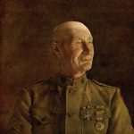
One of the earliest art books I received as a child was a gift from my mother. It was unusual in that it wasn’t for any particular occasion, she just brought it home for me one day. The Art of Andrew Wyeth1 is the catalogue for a 1973 Wyeth retrospective at the de Young Museum in San Francisco. My mother did not see the show; I don’t know how she became aware of the book or what prompted her to buy it for me, as I had no idea who Wyeth was. Being about ten years old, I didn’t think to ask, I just happily accepted the gift. When she gave it to me, she specifically pointed out that in the painting The Patriot, one can see the stitching on the buttonholes of the sitter’s World War I uniform – she liked the amount of fine detail Wyeth achieved in his major works, which were painted in egg tempera.2 He built up these pieces slowly, often taking six months to complete one; he also used this heavily-layered technique, which he compared to weaving, in his drybrush works. I did find this fascinating, and when I first had the book, it was this aspect of Wyeth’s work on which I focused.

Roughly a decade later, in the mid-1980s, I was given Two Worlds of Andrew Wyeth,3 the catalogue to a another Wyeth retrospective. The “two worlds” of the title are the Kuerner Farm in Chadds Ford, PA, and the Olson Farm in Cushing, ME, the two primary places where Wyeth painted. This time the gift was from a consort – an old estranged fiancée of mine. I think the young woman was attracted to the work because of the rural settings, to which she could relate, and the fact that Wyeth had such a strong connection to those environments and to the people who inhabited them. I grew up in the suburbs, so the barns and milk cans and drying corn and bags of grain were all very foreign to me. Wyeth’s strongest paintings have a mysterious aspect, a gothic atmosphere, which is rooted in such imagery.

In 1986, there was an explosion of Wyeth hype when the existence of the “Helga Pictures” came to light. The story was, Wyeth had, for more than fifteen years, been secretly painting a neighbor, Helga Testorf, and putting the unseen work in storage. He was more than twenty years her senior, and they met while she was working as a nurse caring for Karl Kuerner, of the aforementioned Kuerner Farm. It was said that neither Andrew’s wife Betsy nor Helga’s husband had known about their artist/model relationship. When asked about the work, Betsy’s one-word reply was that it was about “Love.” It turned out the story was somewhat contrived, but nevertheless, during the week of August 18, 1986, Wyeth paintings of Testorf graced the covers of both Time and Newsweek.4

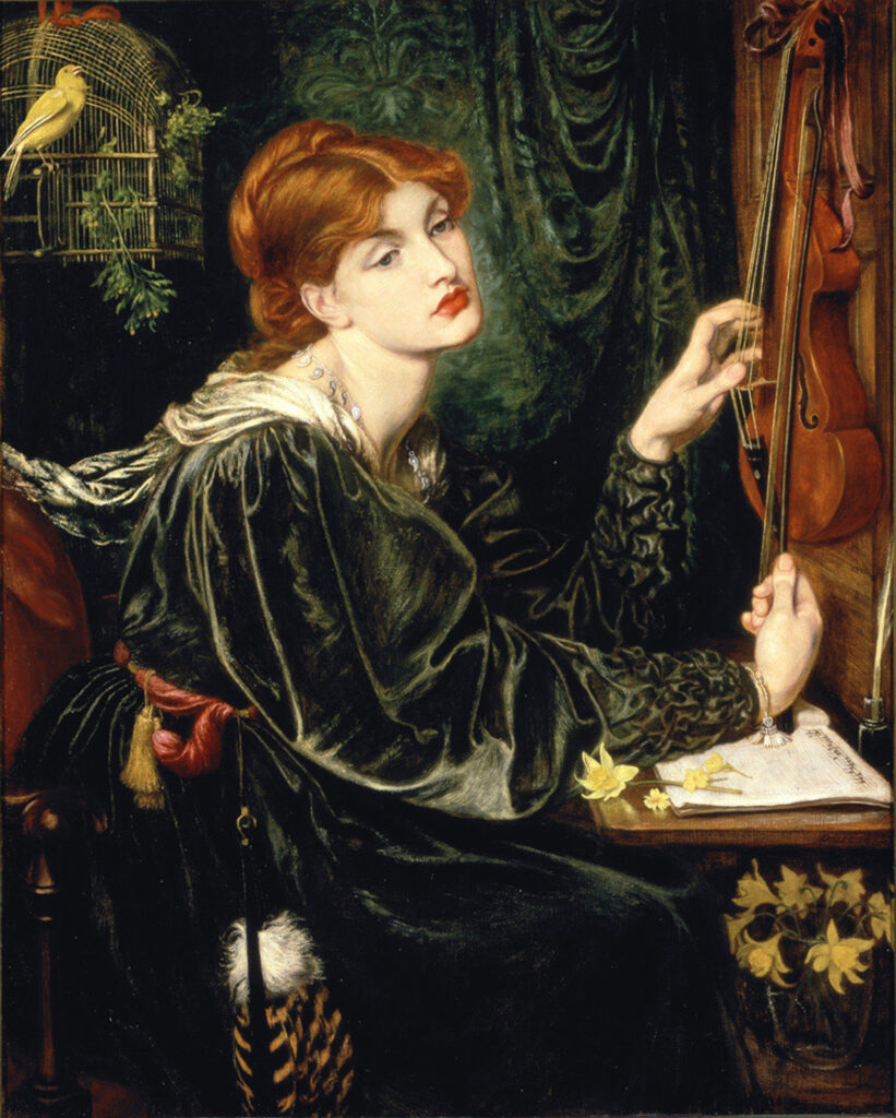
The next year, an exhibition of the Helga work was mounted at the National Gallery of Art, and a catalogue5 was published. A couple years after that, I was given the book by a woman with whom I had become acquainted. Her primary art predilection was for Art Nouveau illustrator Alphonse Mucha, but she was drawn to what she perceived as the romantic nature of the Helga pieces. Her favorite image in the book was Night Shadow – I prefer the similar, but earlier full-length Black Velvet. Although Helga appears to be asleep in both pieces, they are among the most physical of the series, which is made up of hushed, contemplative works. This quietude, coupled with the fact that she is always solitary and often nude, could certainly evoke a romantic impression.

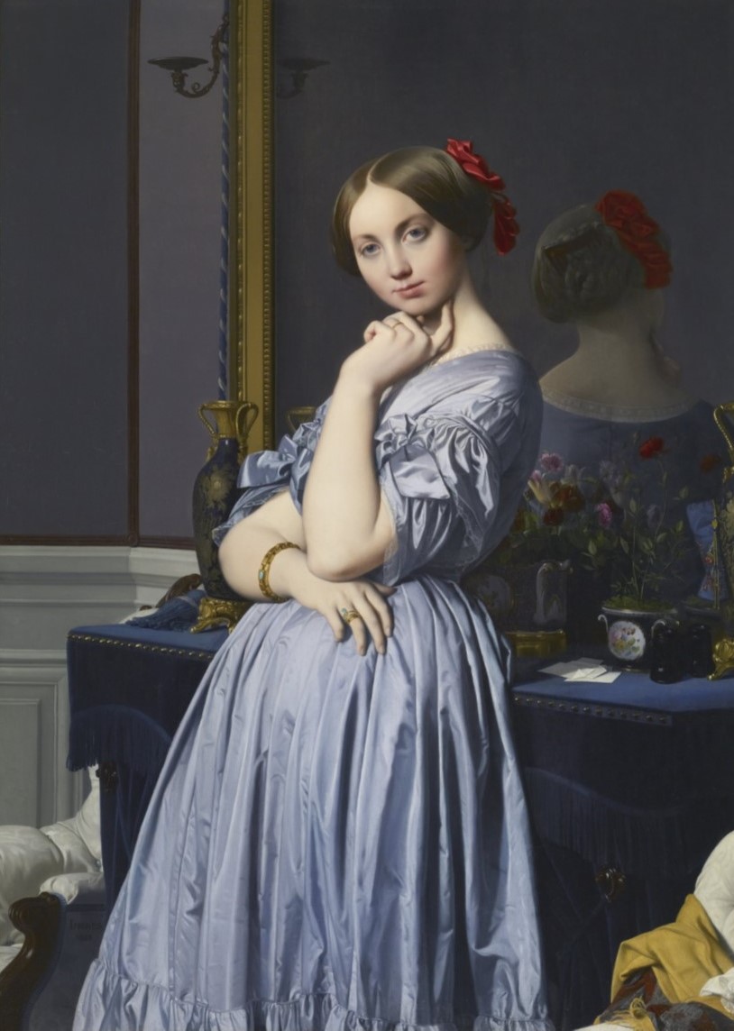
Each of these books was given to me by a person who was attracted to Wyeth’s work, each for a different reason. I can appreciate all of their points of view, but am mainly interested in his draftsmanship. I don’t believe I’ve ever seen any actual pieces by Wyeth, but I find his graphite drawings to be the strongest work of his oeuvre. Although they can be intricately detailed, they have a freeness to them that is not apparent in his tempera paintings. Many of the most engaging examples have an Ingres-like quality, in which parts of the image materialize three-dimensionally, while other areas drop back in outline.

In 2002, Andrew and Betsy, who was his business manager, set up the Wyeth Foundation for American Art, which retains ownership of some 7000 of his works, many of which are graphite or watercolor sketches and studies which Wyeth considered not polished enough for exhibition. Perhaps this work will go some way in revising the not unpopular notion that Wyeth was an “illustrator” rather than an “artist.” His rise to prominence took place more or less contemporaneously with that of the Abstract Expressionists, who brought the art world’s focus to the United States, specifically New York City, for the first time. Wyeth’s paintings must have seemed antiquated by comparison, but I do find a certain charm in someone working so against the grain. Although throughout his career he did occasionally drift into what I would consider illustrative territory,6 I don’t believe his artistry is in question.

Andrew Wyeth, after a short illness, passed away in 2009 at ninety-one. Betsy Wyeth, whose health had been declining for some time, died eleven years later at ninety-eight. Helga Testorf still resides in Chadds Ford, PA. Wyeth’s studio, the Kuerner Farm, and the Olson House have all been registered as National Historic Landmarks, and can be visited by the public.

My mother continues to be impressed with the detail in Wyeth’s paintings, although she doesn’t recall why she decided to purchase the book for me. It’s been over thirty years since I’ve seen either of the two women from whom I received the other catalogues; I hope they’re both doing well.

All three books are still in my possession.


1 Wanda M. Corn, et al.; The Fine Arts Museums of San Francisco, California (1973).

2 Egg tempera is dry pigment mixed with distilled water and egg yolk. It takes months to dry completely, but once it does, it is hard and durable – think about how difficult it is to wash yesterday’s breakfast dish with your half-eaten sunny-side up eggs on it. Wyeth initially saved the whites, with which his wife Betsy would make angel food cakes. Eventually, their friends and family all got tired of that and he started simply throwing the whites away.

3 Thomas Hoving; The Metropolitan Museum of Art (1976).

4 Just like Bruce Springsteen, baby, eleven years earlier.

5 John Wilmerding, et al.: The Helga Pictures; Harry N. Abrams, Inc. (1987). Although the exhibit did travel, and came to San Francisco’s de Young Museum in 1988, I did not see it.

6 See Christmas Morning (1944), The Revenant (1949), Day Dream (1987), and Omen (1997), for example.

Jasper Johns: Target with Four Faces (1955).The circumstances under which I was introduced to the work of Jasper Johns are lost to me, but I’m fairly certain the first painting of his I saw was Target with Four Faces.1

What initially struck me about the piece was the texture of its surface – at the time, I didn’t even know what encaustic, the painting’s medium, was; I had to look it up. It is an ancient technique, little-used when Johns discovered it. The vehicle is wax; he mixes it with oil paint as the pigment. Encaustic dries so quickly that each individual brushstroke, each individual drip, is discrete; even when layered, each retains its own quality. Johns would later gain more finesse in his technique, taking full advantage of the medium’s unique look – smooth, soft, and translucent, almost like skin. However, even at this stage, the surfaces of his work are distinctive and seductive. Additionally, in Target with Four Faces, Johns employed torn newspaper collage as a visual texture able to be seen through the encaustic.

Johns has said early in his career, “I tried to hide my personality, my psychological state, my emotions.”2 Certainly, compared to, say, Willem de Kooning’s or Francis Bacon’s contemporaneous work, his does appear reserved. Targets, like the flags, numerals, and letters he also utilized, are a pre-formed design, “things the mind already knows,” as he put it. Once he settled on his subject matter, it was something that he, and presumably the viewer, didn’t have to think about.3 Johns’ focus was on the process of making a painting, and the nature of art itself – is it a target, or is it a painting?

Regardless, I find Target with Four Faces diverges from Johns’ stated tenet. With the addition of the four plaster casts of the bottom half of a face, the target becomes emotionally and psychologically charged. The piece has an uncomfortable edge – the casts are cut off just below the eyes; the faces are, in essence, blindfolded, bringing to mind a firing squad. It’s as if the viewer, facing the target, is the executioner. I can’t fathom how this piece must have looked in the pre-Pop, pre-Minimalist world of 1958, when it was shown in his first solo exhibition,4 but when I saw it for the first time, twenty-one or twenty-two years later, it still packed quite a punch, even in reproduction.

Johns was successful in creating work that would be viewed as emotionally neutral – his first show was seen as a reaction against the Abstract Expressionism of the time, and later on, as a precursor to the “detached” Pop and Minimalist movements. However, one does wonder if, as a gay man in 1950s America, he felt threatened – targeted, as it were – and if this anxiety was revealed in Target with Four Faces.


1 The other possibility for this distinction is Flag (1955); either way, it was an astonishing initiation.

2 April Bernard and Mimi Thompson: “Johns On…”; Vanity Fair, February 1984, page 65.

3 Nevertheless, it does seem like it was a contentious time to be painting the US flag – the McCarthy hearings had taken place only the year before.

4 Yes, his first solo exhibition. There was no growing up in public; Johns appeared to have arrived fully formed and with quite a splash. Target with Four Faces was reproduced on the cover of the January 1958 issue of ARTnews, and it and two other pieces from the show at the Leo Castelli Gallery were purchased for the Museum of Modern Art, New York. He was not yet twenty-eight years old.

I recently paid a visit to the Catharine Clark Gallery in San Francisco to see American Gothic, a collaborative exhibition by Deborah Oropallo and Michael Goldin. The mixed media work that comprised the show concerns their farm in Northern California and ecological issues, subjects which are obviously related and both of which Oropallo has addressed in her work over the past several years.

Although I’d previously seen at least one sculpture by Oropallo,1 I believe this is the first gallery show I’ve attended to feature such work. I’m not familiar with Goldin, but Oropallo’s aesthetic is so strong and makes such a seamless jump to the three-dimensional that it actually took some time before I realized I hadn’t before seen a show of hers largely made up of sculptural work.

Oropallo and Goldin’s piece American Gothic takes not only its title but its imagery from the Grant Wood painting, possibly the most recognized work in the history of American art. Wood’s two figures are gone, leaving only the farmer’s spectacles and his pitchfork, which now has a sewn rawhide handle replacing the functional wooden one. The Gothic-style farmhouse window from Wood’s piece appears as “reflections” in the lenses of the glasses. By encapsulating the composition in just these elements, Oropallo and Goldin have retained the “salt of the earth” allusion while opening up the image, making it less specific and more inclusive. The piece reimagines Wood’s painting in a manner that steps up the original slightly unsettling feel while also being informed by its common satirical reading and innumerable parodies.

Figuring prominently in the show are images of animals and objects from the farm. Bulls, boars, chickens, and especially sheep appear, or are at least conjured, as well as boots and buckets. Several of the three-dimensional pieces feature ducks; those in Crude and the Reflections series, covered in glossy or matte black resin, recall those horrible photos we’ve all seen of birds caught in the oil tanker spills which wreak havoc on our environment, both in the ocean and on land. In Dangling Ducks 1 and 2, the fowl appear to be burned and melting, their bills seemingly turning to liquid and dripping, as if in some darkly surreal animated cartoon.

I’ve been following Oropallo’s career for about thirty years, and her work continues to surprise. Even so, she is always building on her previous work, and certain motifs – her personal environment and the fairy tales in the present exhibition, for example – have appeared and re-appeared. This continuity was accentuated by the showing in the gallery of additional pieces, not part of this body of work, some dating back to the early 1990s. Snow White (1994) and Bad Apples (2016) both have Snow White-inspired imagery, as does the new HAVEAHART, a disturbingly humorous piece that has Snow White and all Seven Dwarfs caught in animal traps.2 Similarly, the painting Cloning Bo Peep from 2010 has echoes in BO PEEP, which evokes violence of some sort; taken by itself, I would assume against women, as so many fairy tales end badly for them. However, given the themes of the show, I think its subjects are industrial farming and animal cruelty.

Although in her video pieces Oropallo has been working with other artists for several years,3 I believe she has only recently started doing so outside of that medium.4 I presume she is attracted to the creative dialogue inherent in collaboration, which exposes her to different approaches, as throughout her career working alone, she has continually changed her techniques for making art. Like Robert Rauschenberg, she seems uncomfortable getting too comfortable – this has served her well; she has consistently produced engaging, challenging exhibitions, of which American Gothic was but the most recent.


1 Love + Marriage (2004), which celebrates the same-sex marriages that took place in San Francisco over twenty-nine days in February/March 2004, is on view at San Francisco City Hall, South Light Court.

2 The Haveahart® company makes humane catch and release animal traps, eight of which are used in the piece.

3 Three videos were shown in the Catharine Clark Gallery media room during the run of American Gothic. White as Snow, Wolf, and Dirty are all collaborations with Jeremiah Franklin, and take as their subject gender issues – another of Oropallo’s recurring interests, which she has also notably explored in the series Guise and Kink, among others.

4 To my knowledge, this is only the second time – Oropallo and Andy Rappaport, who have worked together on video pieces, produced the letterpress print DISARM in 2020.

Of all Jean-Augusta-Dominique Ingres’s work, I have a preference for his portraits, and for Comtessa Louise-Albertine d’Haussonville in particular. Although I have long found it one of the most captivating paintings ever made, Ingres was initially unhappy with the portrait, asserting he’d failed to convey “all the graces of that charming model.”1 However, ten years later, he did request and obtain its loan for his 1855 retrospective at the Exposition Universelle, Paris, so I assume he warmed to it.

The Comtessa was obviously a lovely young woman, and in Ingres’s depiction, she is startlingly present, her gaze direct and coquettish. The rest of the image is equally compelling – the interior and still life elements add a calm and informal atmosphere, with objects on the mantle casually placed and her shawl thrown over a chair. And as far as I’m concerned, even if the painting were simply of just the dress it would still warrant inclusion, anywhere, anytime, and in any show, of which it would probably be the highlight. Ingres did at least two studies focusing specifically on the folds in the garment, and in the finished portrait, the satin actually feels tangible; one experiences the fabric, the color of which matches the sitter’s eyes, in a tactile way. At a time when photography was still in its infancy, and color photography did not yet exist, Ingres was painting in a photorealist manner which would not become popular until well over a century later.

It’s not only Ingres’s virtuosic painting technique that I admire. I love how he often abstracted the human form as a means to his artistic ends. The figure of the Comtessa reads as anatomically plausible and comes together in such an elegant manner despite her right arm apparently coming out of her side. I’ve read that contemporaneous critics often berated Ingres for these distortions that are obviously not “mistakes,” but examples of his idiosyncratic aesthetic sensibility.

In the mid-1980s, the Frick Collection in New York City mounted Ingres and the Comtessa d’Haussonville, an exhibition dedicated to this single painting. In addition to the portrait itself, fifteen of the sixteen known surviving preliminary drawings and an early oil sketch were also presented. Alas, I did not see this show.


1 Charles Blanc: Ingres: Sa Vie et Ses Ouvrages; Paris (1870), page 145. If Ingres was correct in his assessment, just how beguiling the Comtessa must have been is quite beyond my comprehension.

On Saturday, September 12, 1964, Alberto Giacometti had planned on spending the afternoon in his Paris studio doing a quick oil sketch of his friend, American writer and art historian James Lord. The painting he started that day ended up taking eighteen sittings and nearly three weeks to complete. Lord wrote a slim volume, A Giacometti Portrait,1 about the experience. Each of the short chapters chronicles a day that he served as the model for the piece.

I first became familiar with the book in the early 1990s; I’ve since read it six or eight times. The title has a double meaning – the book is about the painting, but Lord’s observations also serve as a written portrait of Giacometti himself. He documented their discussions about not only the painting at hand, but personal matters, Giacometti’s work in general, and other artists, as well. On day nine, their conversation turned to Picasso:

“He’s done everything,” I said. “It reminds me of a story Dora Maar once told me. She said Picasso had said to her, ‘Being unable to reach the top of the scale of values, I smashed the scale.’”

Alberto snorted. “That doesn’t mean a thing. It’s like all of Picasso’s remarks. At first they seem full of wit, but in fact they’re empty of meaning.”2

I laughed out loud the first time I read this, because it’s pretty much exactly how I feel about Picasso.3 It was so refreshing to hear from someone who wouldn’t even figuratively bow down to him – Paloma Picasso said as a child she would see people literally doing so.4

Giacometti’s post-Surrealist oeuvre is one of the most distinctive of the twentieth century. Unfortunately, I haven’t seen much of his actual work in many years – I did attend the retrospective Alberto Giacometti 1901-1966 at the San Francisco Museum of Modern Art in late 1988 or early ’89. Although this was prior to my becoming enthralled by his paintings, which happened a few years later, even then I preferred them to his sculpture, for which he is most celebrated. I especially like the later paintings, where the figure dominates the picture plane and the ground is an amorphous space with the room and objects in it merely suggested. There is very little in the way of traditional modeling in these paintings – Giacometti used line, value, and muted, minimal color to create the illusion of form. I understand the elements he used to achieve this, but how it coalesces – how a figure can actually emerge from a tangle of linear brushwork in such an evocative and engaging manner – is a mystery to me.

Giacometti would paint, paint out, and re-paint a head over and over again, dozens of times. Lord described their artist/model relationship as somewhat sadomasochistic – he postponed his return flight home to New York several times to continue to sit in an “aura of anxiety” for the portrait. Although he liked that Giacometti was not only painting him, but had promised to give him the piece, the fact that often seemingly no progress would be made after hours of modeling started to wear on him. Giacometti insisted that what he was attempting to accomplish – capturing in paint how he saw, his vision – wasn’t even actually possible, which led to this drawn-out process. His wife Annette, who often sat for him, told Lord it could go on indefinitely.5 He often kept a work in progress over a period of years, re-painting or re-sculpting until some outside deadline forced him to let it leave the studio. What Giacometti wanted may have been clear to him, but getting there was apparently a futile endeavor.

Giacometti’s obsessive nature also influenced his conversation. On day two, Lord asked him if he had ever thought of suicide, and Giacometti responded that he thought of it, and how to do it, every day. Not because he didn’t want to live, but because he thought dying would be a fascinating experience. He told Lord that for months, he spoke about burning himself alive at four a.m. on the sidewalk in front of his studio. Annette eventually became so exasperated that she yelled at him “Do it or shut up!”6

Giacometti did not set himself aflame in the early hours of the morning outside his studio, but he didn’t have much longer to live. On January 10, 1966, a little over a year after Lord sat for him, while in the hospital being treated for exhaustion and heart and circulatory issues, he was diagnosed with pericarditis, an inflammation of the tissue surrounding the heart. He passed away the next day at sixty-four.

In 1985, James Lord’s comprehensive Giacometti biography,7 which Alberto’s brother Bruno praised as “nearly an autobiography,” was published. Lord passed away in Paris from a heart attack in 2009 at eighty-six.


All artwork © Estate Giacometti (Fondation Giacometti + ADAGP).


1 Originally published in 1965 by the Museum of Modern Art, New York, my copy is the Revised Edition; The Noonday Press (1980). I have no idea what was “revised” – I do wish Lord had written a more detailed overview of the time to give context, rather than the brief note included at the end of the book.

2 Ibid, page 53.

3 Although some of my favorite painters – Willem de Kooning, Francis Bacon, Jasper Johns, Roy Lichtenstein – held or continue to hold at least part of Picasso’s oeuvre in high regard, I’ve never seen a painting by him that really engaged me, and I, too, find his quotes insufferable.

4 Paloma Picasso, Pablo’s daughter, recounted this in an interview I read, in the early or mid-’80s, probably in Interview magazine.

5 James Lord: A Giacometti Portrait, page 64.

6 Ibid, page 14. Call or text 988 for the National Suicide & Crisis Lifeline; it’s free and confidential.

7 Giacometti: A Biography; Farrar, Straus and Giroux (1985).

On Saturday, March 25, 2023, I participated in artist Angie Eng’s performance of Right On!, a “social justice art walk” conceived in response to the history of systemic racism and the rise of hate crimes against Asian American/Pacific Islanders in the United States.1

There were about 170 performers, all AAPIs, split into five groups, each with traditional Asian drummers/percussionists at the tail end. All were dressed in black, and the group traversed sixteen blocks through downtown Sacramento in a slow, deliberate, single file procession from the Robert T. Matsui Courthouse to Capitol Mall and back. Everyone wore a black T-shirt with one of seventeen dates printed on the front. The shirt design references Japanese conceptual artist On Kawara’s Today series of paintings,2 and each date corresponds to an Act passed by Congress, a Supreme Court decision, or an Executive Order which targeted AAPIs in the US. The back of each shirt has a QR code which contains a short summary of what happened on the date.

I consider myself part of an Asian community, as I do attend cultural events related to my heritage. However, outside of my family, I really don’t have much contact with many Asians in my everyday life. As far as I know, I am acquainted with just one other person who participated as a Right On! walker. At the onset of the performance, I felt I was only sharing the experience with her. However, a sense of unity and purpose quickly became palpable to me, and that feeling escalated through the 1 1/2 hours of the walk.

By recognizing inequities that AAPIs have endured over the course of our nation’s history, the Right On! walk bridged the past with the present – the oldest date cited was April 16, 1850,3 the most recent, October 17, 2022.4 Perhaps obviously, the date with the greatest emotional impact for me was February 19, 1942, when President Franklin D. Roosevelt signed Executive Order 9066, which forced over 125,000 Japanese and Japanese Americans – including both sets of my grandparents, my parents, my aunts, uncles, and other relatives – from their homes and from their lives and into relocation camps5 in inhospitable wastelands away from the West Coast.

I have spoken with two people who viewed the walk from more of a spectator perspective, and both said it was a powerful display of solidarity. In addition to the emotional resonance the performance had for me, Right On! was an educational experience, as well – I had been familiar with only a few of the seventeen decisions referred to on the shirts.

Right On! was first performed in Boulder, CO on October 8, 2022. Sacramento hosted the second performance of the piece, and the first which incorporated the traditional musicians, who I believe added to the gravitas of the work. It was satisfying for me to have been able, in a small way, to assist in bringing Angie Eng’s empowering artistic vision to fruition.


1 Anti-Asian American/Pacific Islander hate crimes nationwide increased, compared to the previous year, in 2020 by 124% and in 2021 by 339%.

2 Kawara started his Today series in 1966 and continued it for over forty-five years. He completed nearly 3000 pieces, each of which consists of a monochromatic canvas of red, blue, or gray with the date on which it was made painted in a simple, sans-serif, white face. He did not make a painting every day, but sometimes did more than one in a single day. If a painting was not finished by midnight, it was destroyed.

3 The 14th section of the Act of April 16th, 1850, regulating Criminal Proceedings, provides that “No black or mulatto person, or Indian, shall be allowed to give evidence in favor of, or against a white man.” While the text seems to be inapplicable to Asians, in People v. Hall in 1854, the California Supreme Court held that the term “black person” “must be taken as contradistinguished from white,” and included all races other than Caucasian.

4 The US Supreme Court declined to hear Fitisemanu v. United States, which sought to challenge the lack of citizenship for those born in American Samoa, a US territory.

5 “Relocation camps.” As if horseback riding and singing songs around the campfire were on the agenda.